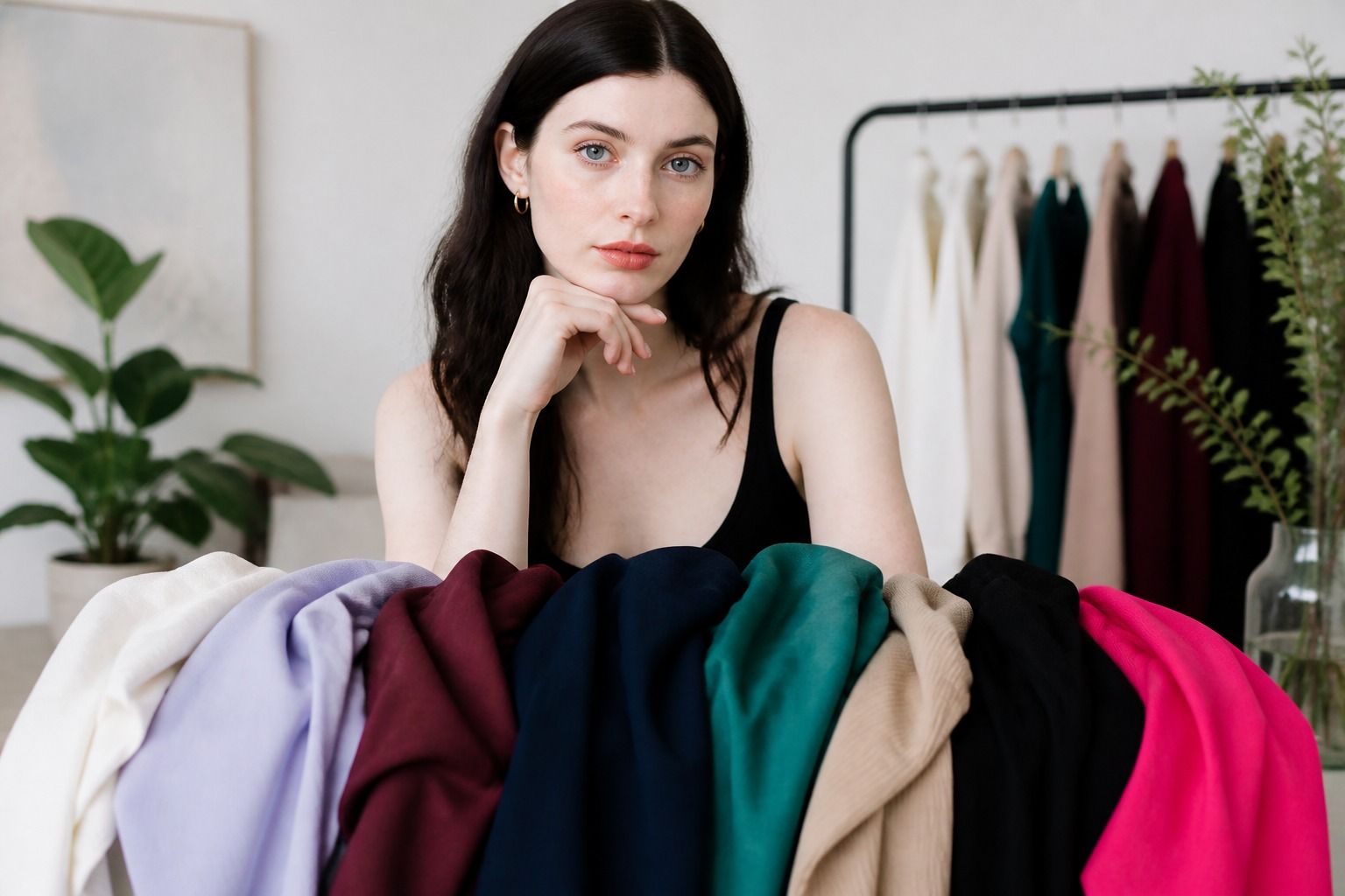
Sixteen season color analysis is useful when four broad labels leave you with too many almost-right colors. It gives more room to describe a palette as light, soft, deep, or clear instead of stopping at Spring, Summer, Autumn, or Winter. The extra detail can make shopping easier, but it can also create a new problem: different systems use the same names in slightly different ways. The practical answer is to read the label as a description of color relationships, then test those relationships in fabric. A result should help you choose a smoky navy over a harsh black, or a warm coral over an icy pink, without turning a wardrobe into a set of forbidden squares.
Why some systems use 16 seasons
The four-season model is a useful map, but it is broad. Summer, for example, can include people who look best in very light cool colors and people who need more depth while still needing a muted, cool quality. One label cannot show every useful distinction. Expanded systems split the broad families into sub-seasons so a person can work with the part of the family that fits best.
There is no single official chart for 16 season color analysis. A consultant may use True, Light, Soft, and Deep as the main modifiers. Another may use Warm, Cool, Clear, or Bright in a different arrangement. Some systems sit closer to the twelve-season model and add four extra bridge categories. The names are not a scientific standard, so the label matters less than the qualities it is meant to describe.
The extra labels are especially helpful when you have a strong reaction to one dimension of color. You may sit in the cool family but need softness rather than clarity. You may handle warm colors but look better when they are light and clear instead of deep and earthy. A broad label tells you the neighborhood. A sub-season points to the streets where your clothes are more likely to work.
That distinction also explains why an online 16 seasonal color analysis quiz can disagree with another test. The quiz may use different boundaries, different photographs, or different meanings for the word deep. Rather than asking which chart is the true one, ask whether the proposed palette explains what happens when you wear certain colors. A useful system should make your observations clearer.
Think of the model as a filing system for colors, not a measurement of your identity. If one label helps you compare clothes and another does not, use the helpful part. You can keep the broader family and ignore a sub-season that makes you second-guess every purchase.
How the expanded labels are organized
Most expanded systems begin with the same four families. Spring usually points toward warmth and clarity, Summer toward coolness and softness, Autumn toward warmth and depth, and Winter toward coolness and clarity with stronger contrast. Sub-season words then tell you what the family needs more or less of. Light reduces depth. Soft reduces saturation. Deep increases visual weight. Clear or bright increases intensity and separation.
| Common label family | Trait being stressed | Useful comparison | Clothing implication |
|---|---|---|---|
| True or warm seasons | Temperature is the clearest signal | Warm coral beside blue-red | Start with the warm or cool direction before chasing depth |
| Light Spring or Light Summer | Low to medium depth with a clear pale range | Apricot or powder blue beside deep burgundy | Keep dark colors away from the face or soften them |
| Soft Summer or Soft Autumn | Muted chroma and gentle contrast | Dusty rose beside bright magenta | Choose greyed, blended colors instead of sharp brights |
| Deep Autumn or Deep Winter | Depth and stronger visual weight | Chocolate or ink navy beside pale beige | Use medium to deep colors, while checking temperature |
| Bright or clear Spring or Winter | Clarity, intensity, and clean contrast | Clear turquoise beside smoky teal | Let a crisp accent carry more of the outfit |
This table shows common naming patterns, not a universal sixteen-box prescription. True Spring and Warm Spring may be treated as the same idea in one method and as slightly different in another. The same is true of Clear Winter and Bright Winter. Read the description beside the label. If a chart calls your palette Deep Winter but the examples are softened and slightly warm, the examples are giving you more useful information than the title.
The twelve-season model often uses three subdivisions around each main family, such as Light, Soft, and Cool Summer. A 16-season approach may add a fourth route, separate a border season, or use four modifiers around a different core. This is why you should not copy a palette from one system into another without checking what the words mean there.
Read dominant and secondary traits
A good result usually has a dominant trait and one or two supporting traits. Dominant means the quality that changes the face most strongly. For a soft palette, mutedness may matter more than whether the color is slightly warm or cool. For a deep palette, a pale pastel may fail before you have enough evidence to debate its temperature. The order keeps the test manageable.
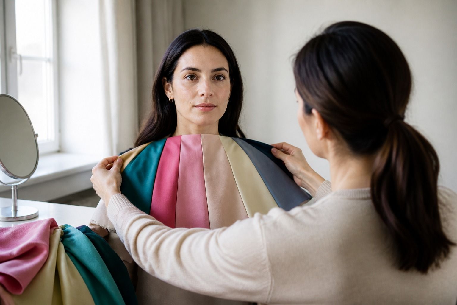
Start with large fabric comparisons. A cool rose and warm peach test temperature. A dusty rose and clear pink test chroma. A misty blue and deep navy test value. A charcoal sweater and a high-contrast black-and-white combination test contrast. Do not compare four traits in a single outfit. If the fabric changes color, texture, and depth at once, you will not know what caused the better result.
Look at the face rather than the garment. The strongest color may be attractive on its own and still make the eyes look distant. The quieter shade may seem dull on a hanger but leave the skin more even. Check the under-eye area, the edges of the mouth, and the shadow under the jaw. Take the photographs from the same distance and turn off portrait mode, which can smooth the very differences you are trying to observe.
Undertone is part of this process, but it is not a shortcut through it. A neutral or olive complexion can respond well to both warm and cool colors when the depth and softness are right. Surface redness can make a cool skin tone appear warm in a bathroom mirror. Hair color can also alter the amount of contrast you see, especially after dyeing. Use the face, fabric, and daylight together.
Once you have a dominant trait, choose secondary traits as adjustments. Someone who is mainly soft and cool may prefer the cooler side of a soft palette. Someone who is mainly deep and warm may need rich colors that are less orange than classic Autumn examples. The sub-season becomes practical when it tells you what to turn up and what to turn down.
Avoid getting stuck between two labels
Two nearby labels often share their best middle colors. Light Summer and Light Spring can both use pale blue, but one may need a cooler greyed version while the other comes alive in a warm aqua. Soft Summer and Soft Autumn can both wear mushroom taupe, but their rose and cinnamon versions reveal the temperature difference. Deep Autumn and Deep Winter can share a dark berry, while rust and blue-red separate them.
Make a border-season test with three colors from each side and one shared neutral. Keep the value similar so you are not accidentally testing pale against deep. Hold each fabric below the face for ten seconds, move it away, and repeat. If one side looks better in the face but the other side fits your wardrobe, keep the shared middle and use the preferred side for tops, scarves, and collars.
Do not let an online 16 season color analysis test push you toward a more dramatic label because you have dark hair or striking eyes. Contrast comes from the whole face, including the difference between skin, eyes, brows, and hair. A person with dark hair can still need soft colors. A person with light hair can still handle a strong navy. The label should describe the clothing response, not the visual story you have been told about your features.
It is also fine to get different answers at different points in your wardrobe. A new hair color, a tan, or a change in the kinds of fabric you wear can alter your impression of contrast. The underlying response to color may not have changed, but the framing has. Put more trust in repeated comparisons than in the most confident sentence on a quiz result page.
When the boundary stays unclear, name the problem precisely. Are both seasons cool, but one is too bright? Are both muted, but one is too warm? Are both deep, but one makes the face look yellow? A precise uncertainty is much easier to shop with than the general feeling that nothing works.
Build a practical palette from the result
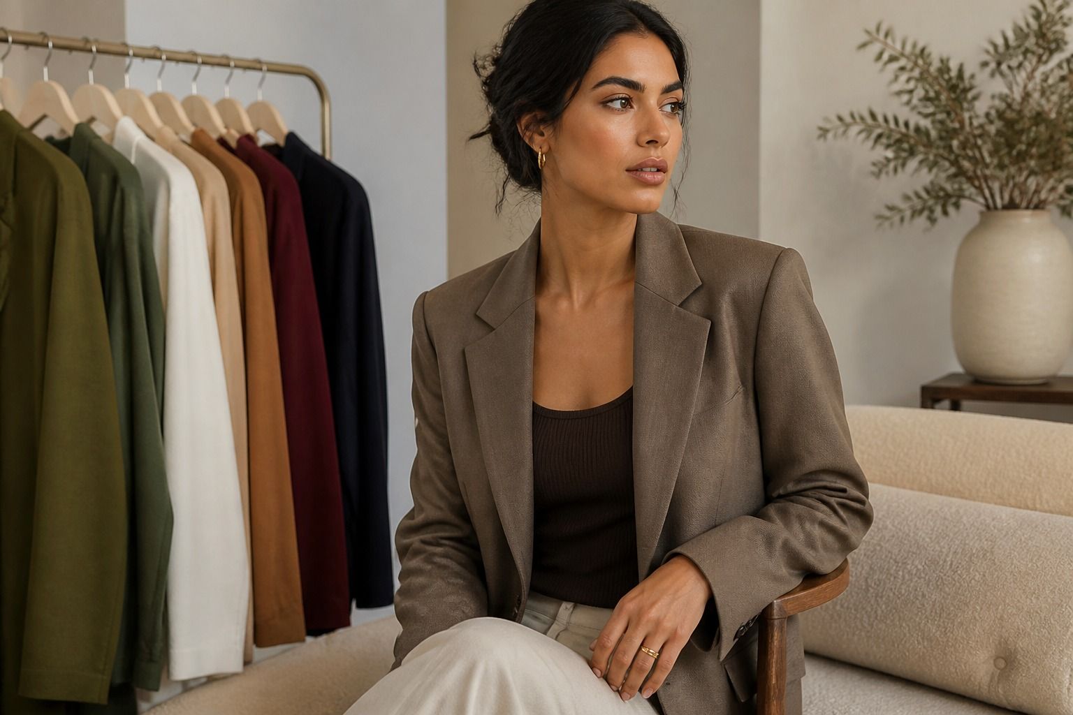
Start with neutrals because they do most of the work in a real wardrobe. A Soft Summer result may point you toward charcoal, smoky navy, blue-grey, and soft white rather than stark black. A warm, deep result may make chocolate, olive, camel, and warm navy more useful. A clear Winter result may support black, optic white, true navy, and clean jewel tones. These are starting points. The exact fabric and distance from the face still matter.
Choose three or four face-adjacent colors that you can repeat. A Deep Winter wardrobe might use ink navy, blue-based berry, cool emerald, and crisp white. A Light Spring wardrobe might use warm ivory, clear aqua, light coral, and fresh leaf green. The goal is not to own every color associated with a sub-season. It is to have enough reliable options for work, errands, and the occasions when you need to dress quickly.
Then add flexible colors outside the palette in lower-risk positions. A warm leather belt, a bright shoe, or a patterned skirt does not sit in the same visual relationship as a solid blouse under the chin. Texture can also soften a strong shade. A black cardigan in a fine knit may be easier than a stiff black shirt because the surface breaks up the contrast.
Be careful with digital swatches. A color that looks muted on one screen may be bright on another, and the same dye can shift under shop lighting. Take a fabric sample or photograph the garment beside a neutral grey in daylight. If the color works only as a tiny square on a screen, it has not yet earned a place in your wardrobe.
The best use of 16 color seasons is modest and practical. Let the result narrow a crowded choice, give you better words for what has always looked right, and explain why two similar shirts behave differently. Keep personal taste in the room. A palette is successful when it helps you get dressed with less friction, not when it makes you afraid to wear a color you love.