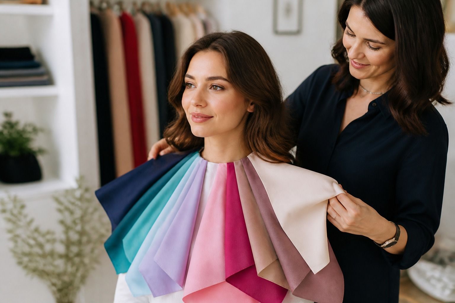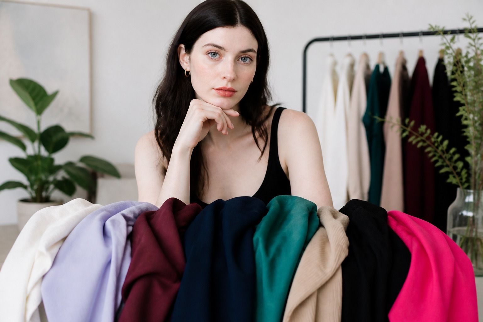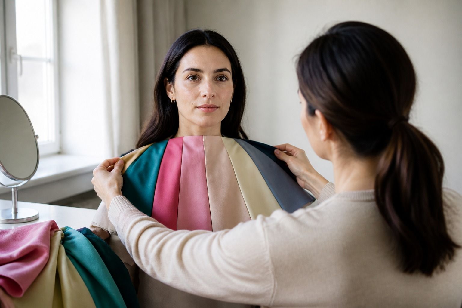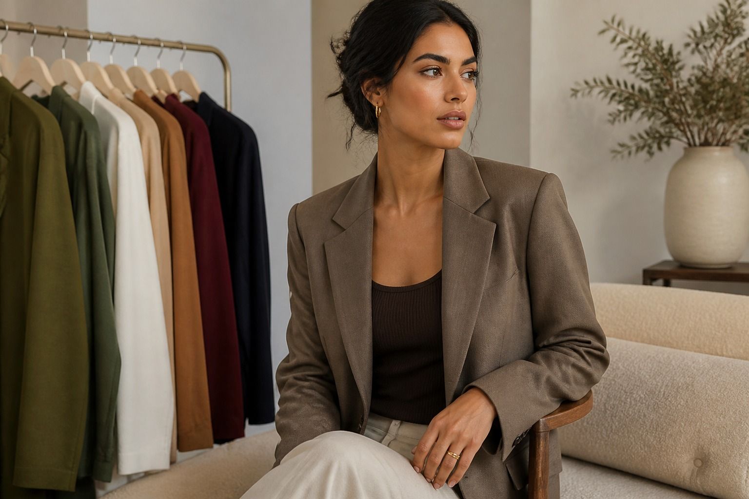
The best colors for olive skin tone are rarely a fixed list that works in the same way for everyone. Olive coloring can lean warm, cool, or neutral, and the depth of the complexion changes how much contrast a garment creates. A shade that looks calm and polished on one person may make another person look grey or yellow. A useful olive skin tone color palette starts with a few comparisons, then turns those observations into clothes you can actually wear.
Start with the version of olive you have
Olive skin often has a muted green or grey quality beneath the visible surface color. That quality can sit with a golden cast, a cooler grey cast, or a fairly balanced mix. Begin by comparing a warm cream with a soft white, camel with cool taupe, and rust with blue red. You are looking for the colors that make the face look even while keeping the outfit alive.
Undertone is only one part of the result. Contrast matters too. A person with lighter, low-contrast coloring may prefer a softened version of forest green, while someone with deeper or stronger contrast may handle a dense pine shade. Both can have olive skin. The distinction is not about which complexion is better. It is about how much visual weight the color brings next to the face.
Muted colors are often a good place to begin because olive coloring can make very clear shades look disconnected. Smoky teal may work more easily than bright turquoise. Dusty plum may be calmer than electric purple. That does not make bright color off limits. If you love a clear shade, try it in a print, a bag, a skirt, or a layer that creates some distance from your face before deciding whether it belongs in your wardrobe.
Use a garment rather than a tiny digital swatch for the first test. Fabric texture, finish, and scale change the way color reads. A matte rust knit can feel softer than a glossy rust blouse. A denim teal jacket may be easier than a smooth teal shirt. Take quick notes after each comparison. The words even, grey, yellow, sharp, and flat are more useful later than a vague feeling that one color was nice.
Reliable neutrals for olive skin
Neutrals make the wardrobe easier to use because they repeat across trousers, coats, shoes, bags, and knitwear. Olive skin can often work with more than one neutral family, but the temperature and intensity still matter. Soft white, cream, mushroom taupe, charcoal, muted navy, chocolate brown, and olive grey are good candidates to test. The most useful version is usually slightly softened rather than extremely icy, orange, or yellow.
| Neutral to try | Works well when | Watch for |
|---|---|---|
| Soft white | You need light near the face without a hard blue edge | Very icy white can make muted skin look grey |
| Cream | Your olive coloring leans warm or you like earthy combinations | Strong yellow cream can pull the skin toward yellow |
| Charcoal | You want depth with less severity than jet black | Blue-grey charcoal may feel cold on some warm olive complexions |
| Muted navy | You want a dark everyday base that is less stark than black | Clear royal navy can overpower lower-contrast coloring |
| Chocolate brown | Warm olive coloring likes a grounded dark neutral | Red-brown or orange-brown may be too warm beside cool olive |
| Mushroom taupe | You need a middle neutral with a greyed finish | Some taupes turn mauve or green under shop lighting |
Black can still be useful. If jet black looks severe, move it away from the face with a cream shirt, a muted scarf, or a textured fabric. Black trousers and shoes are rarely as demanding as a black turtleneck. The same principle applies to beige. A beige coat may work while a beige top makes the face look dull because the distance and the surrounding colors are different.
Build the base in stages instead of buying every neutral at once. Choose one light neutral, one middle neutral, and one dark neutral. For example, soft white, mushroom taupe, and charcoal create a flexible start. Add cream or chocolate brown if warm colors look better, or muted navy if cooler colors keep the face clearer. This gives you evidence without turning shopping into a search for a perfect shade name.
Greens, blues, reds, and browns to test
Green is a natural place to start, but olive skin does not automatically need more olive green. Forest green, pine, moss, eucalyptus, and muted sage each bring a different balance. Warm olive may enjoy moss and forest green with a yellow or brown base. Cool olive may prefer pine, blue-green, or a smoky teal. Neutral olive can move between them when the saturation is controlled. Hold the top near your face because the difference between a calm green and a green that turns the skin grey can be surprisingly small.
Teal is often more flexible than a pure blue or green. A muted teal can bridge warm and cool clothing, especially when paired with cream, charcoal, or chocolate brown. Bright turquoise has a clearer edge and may need stronger contrast around it. If turquoise makes the skin look flat, try a darker teal or a fabric with a softer finish. If both seem dull, try a cleaner blue-green with a simple neutral rather than adding several more colors.
Blues depend on both depth and temperature. Smoky navy, petrol blue, denim, slate, and blue-green are useful starting points. Cool olive may like a blue red with navy, while warm olive may prefer petrol blue with rust or camel. A pale icy blue can be beautiful in a print or accessory but may look too sharp as a large face-adjacent color. Compare it with a softened powder blue before dismissing blue altogether.
Reds are easiest to sort by looking at the base. Rust, brick, terracotta, and warm tomato tend to suit warm olive more readily. Blue red, cranberry, wine, and cool burgundy are worth testing for cool olive. Neutral olive may use both groups when the color is muted and the rest of the outfit supplies balance. The word red tells you very little on its own, so always compare the actual fabric under the same light.
Browns and purples provide useful alternatives to black. Chocolate brown can anchor warm olive outfits, while espresso may work across a wider range when it is not too orange. Plum, aubergine, and muted berry offer depth for cool or neutral olive. Rust with chocolate looks earthy and relaxed. Plum with charcoal looks cooler and more defined. These combinations show why an outfit can work even when one individual shade is not your strongest near the face.
Why some beige and grey shades turn flat
Beige is often called a safe neutral, but it covers a large range of colors. Some beiges are yellow, some are pink, some are greenish, and some are almost grey. On olive skin, a beige with the wrong cast can merge with the complexion and erase definition. The face may look tired or flat even though the garment itself is attractive. Test beige beside a neutral grey and a soft white. The comparison makes its undertone easier to see.
Grey has the opposite problem. A very blue grey can make warm olive look sallow, while a greenish grey can make cool olive look muddy. Medium charcoal is often easier because it gives depth without announcing a strong color direction. Light grey can work when it has enough contrast against the skin. If it looks dusty, try a warmer greige or a clearer slate rather than assuming all grey is wrong.
Lighting can hide the problem in a store. Warm ceiling lights make cream and beige look friendlier, while cool retail lighting can make grey look cleaner. Take the garment near a window or outside the fitting room. Look at the area beneath the eyes, around the mouth, and at the line where the neck meets the fabric. These places show a mismatch more clearly than the hand or forearm.
Makeup can change the result too. A foundation with a strong pink or orange cast may make a neutral garment seem wrong. If you wear makeup, check the color both with and without it when possible. The goal is to find clothes that remain useful when your routine changes, not to make every shade work only with a carefully adjusted face.
When a color is nearly right, change its scale or position. A beige top may improve with a charcoal jacket. A grey sweater may work with a rust scarf. A difficult yellow can become an interesting shoe or bag. Clothing choices have more options than keep or discard. Use face-adjacent colors for the shades that consistently make you look clear, and move uncertain shades farther away.
Build outfits without over-matching the undertone
Once you have a short list, make outfit formulas instead of a long color chart. For warm olive, try chocolate brown trousers, a cream top, and a forest green layer. Add rust through a scarf or bag if the outfit needs warmth. For cool olive, try charcoal trousers, a soft white shirt, and a muted teal or plum jacket. For neutral olive, combine mushroom taupe with muted navy and choose either a warm or cool accent depending on the effect you want.
These are starting points, not uniforms. A warm olive person can wear plum when it is softened and balanced with a warm neutral. A cool olive person can wear rust when the color is farther from the face or paired with charcoal. Neutral olive often looks most intentional when the outfit repeats a muted quality rather than matching temperature in every piece. The eye reads the relationship between colors before it checks a label.
Accessories make experimentation inexpensive. Use earrings, glasses, scarves, belts, and bags to test a color before buying a coat. Silver, pewter, and white gold may sit comfortably with cool olive; yellow gold, bronze, and warm metal may suit warm olive. Neutral olive can often use either, but the scale and shine matter. A very bright metal near the face may be more noticeable than the temperature itself.
Prints are another way to soften a difficult shade. Look for prints that include one of your reliable neutrals, such as cream with forest green, charcoal with plum, or chocolate with teal. The neutral gives the eye a place to rest and prevents the accent from sitting alone against the skin. If a print looks good at a distance but the dominant color feels wrong up close, wear it with a jacket or choose a smaller scale.
Shopping becomes easier when you carry a few working rules: test the garment by a window, compare two versions of the same color, judge the face rather than the hand, and separate undertone from contrast. Keep notes on the colors that make the skin look even, the colors that need distance, and the colors that only work with a certain texture. Over time, your olive skin tone color palette will come from repeated evidence rather than a universal best-color list.
Olive skin can support a wide wardrobe, but variety works better when it has a little structure. Start with neutrals that give you definition, add greens and blues in the temperature that feels clearest, then bring in rust, plum, teal, or chocolate according to the effect you want. A good clothing color does not have to produce a dramatic reaction. It should let you look present, comfortable, and like yourself in the clothes you chose.