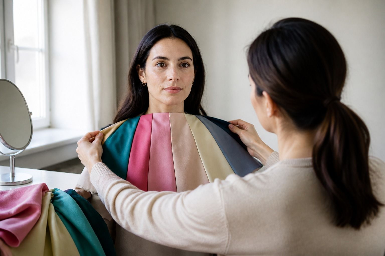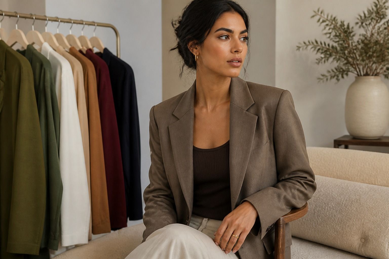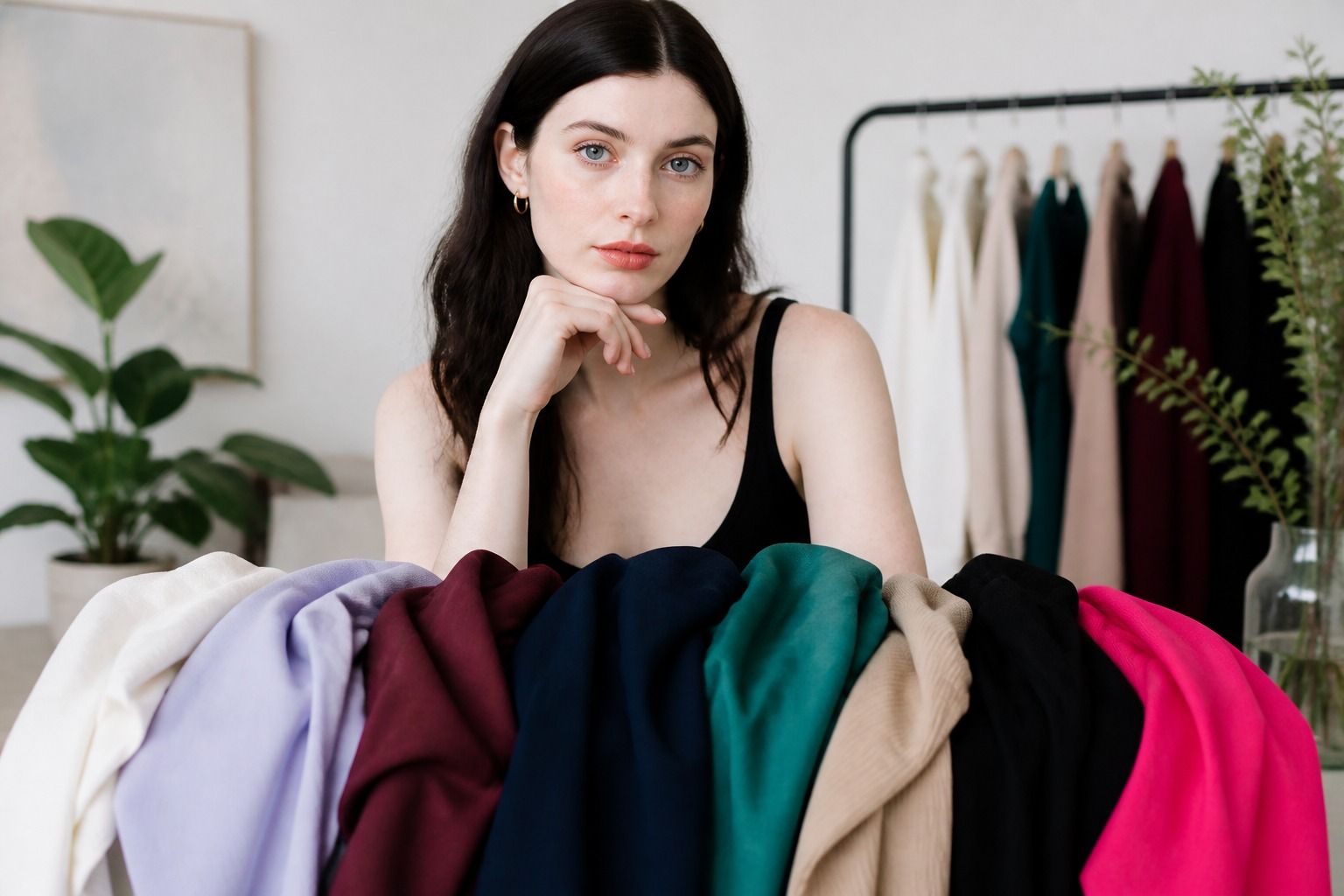
Finding the best colors for pale skin is less about collecting a perfect list and more about noticing what happens when a shade sits beside your face. A pale complexion can look cool, warm, neutral, rosy, muted, or surprisingly high in contrast. The same pale skin may look fresh beside dusty blue and tired beside icy white, while someone else gets the opposite result. I find it more useful to treat color as a series of comparisons: a shirt, a mirror, a window, and a few minutes of honest observation. This guide gives you a practical way to choose colors for pale skin without turning a seasonal palette into a set of rules you have to obey.
Why pale skin is not one undertone
Pale skin describes depth, or how light the surface color appears. It does not tell you whether the undertone leans warm, cool, neutral, or olive. Two people can both describe their skin as fair or pale and need very different clothing colors near the face. One may look clearer in cool pink, blue-red, and charcoal. Another may come alive in soft peach, camel, warm ivory, and moss green. A third may handle both groups if the colors are not too bright or too dark.
Surface color can confuse the first impression. A little redness from the cold, a recent breakout, flushed cheeks, or uneven lighting can make a cool complexion look warmer than it is. Veins can look blue, green, or a mixture depending on the skin depth and the light, so the vein test is only a clue. Hold a piece of fabric under the chin rather than studying your wrist in isolation. Ask whether the color makes the face look even and awake, or whether it pulls attention to redness, shadows, or grey areas.
A useful first comparison is warm ivory against soft white, followed by a muted rose against a peachy pink. Do not ask which swatch looks prettier by itself. Look at the skin beside each swatch. If one shade makes your complexion look more even while the other makes the color seem to sit on top of you, that is meaningful evidence for your personal palette. It is still not a final verdict, because value and intensity may be changing at the same time.
Choose contrast before saturation
People with pale skin are often told to avoid dark colors because they might look harsh, or to wear only delicate pastels because they might look gentle. Both rules are too blunt. Contrast is the distance between the lightness of your face, hair, eyes, and clothing. If your natural features are light and blended, a very dark shirt can dominate. If you have dark hair, dark eyes, or a sharply defined brow, navy, bottle green, and berry may provide the balance that a pale pastel lacks.
Start with the question: does the outfit need low, medium, or higher contrast? A low-contrast outfit keeps the clothing close to the face in value, such as a soft white top with light denim and a pale rose cardigan. A medium-contrast outfit adds definition without making the shirt the first thing people notice, such as navy with heather grey or camel with ivory. Higher contrast might pair a white blouse with ink navy, a black jacket with a clear cool pink top, or a deep green knit with a light neutral. The right level depends on your whole coloring, not skin depth alone.
| Contrast level | Useful starting colors | What to check in the mirror |
|---|---|---|
| Low | Soft white, light taupe, powder blue, pale rose | Does the face stay visible, or does the outfit become one pale block? |
| Medium | Smoky navy, camel, sage, medium denim, muted berry | Do the eyes and features look clearer without a hard edge? |
| Higher | Ink navy, charcoal, deep teal, blue-red, chocolate | Does the dark shade frame the face or create a heavy shadow? |
Notice that the table gives starting points, not commandments. A person with cool pale skin and dark hair may prefer charcoal over camel at medium contrast. Someone with warm pale skin may find chocolate easier than ink navy. If a color is attractive but too strong around the face, keep it in a skirt, trouser, shoe, or bag and use a quieter shade for the top.
Neutrals that do not drain the face
Neutrals do more work in a wardrobe than accent colors, so they deserve careful testing. Optic white can be crisp and useful, but it can also make very pale skin look grey or emphasize redness. Soft white, oyster, light stone, and a warm ivory are often easier starting points. They still need comparison. A yellowed ivory can make cool pale skin look sallow, while a blue-white may make warm pale skin look flat.
Navy is worth trying before deciding that black is your only dark neutral. A smoky or ink navy can give definition with a softer transition than black. Charcoal, graphite, deep taupe, and chocolate brown create different kinds of depth. If black makes your face look sharper in a good way, keep wearing it. If it makes the under-eye area look darker, move black away from the face or break it with a lighter collar, scarf, or necklace.
Camel is another shade that needs a version check. Honey camel and golden tan may suit warm pale skin, while greyed camel, mushroom, or cool taupe may sit better on cool or neutral skin. Beige is not automatically gentle. Some beige shades are so close to a pale complexion that they erase contrast, especially in thin jersey or matte fabric. A slightly darker taupe, a clear cream, or a textured knit can give the outfit more structure.
When shopping, hold the garment at the neckline and step back from the mirror. A color that works on a hanger may fail when it covers the chest and neck. Try the same neutral with your usual lipstick-free face, then with the makeup you actually wear. The goal is not to pass a laboratory test. It is to learn which neutrals make ordinary mornings easier.
Use pinks, blues, greens, and browns by undertone
Pink is a good test color because it exposes temperature and intensity quickly. Cool pale skin often has a useful starting range in dusty rose, mauve, raspberry, blue-based pink, and cool berry. Warm pale skin may prefer peach, coral, salmon, warm rose, or watermelon. Neutral pale skin can often move between these groups, but may still have a preference for a certain depth. If a pink makes the cheeks look lively but not redder, keep it in the working palette.
Blue can be easy or difficult depending on how clear it is. Powder blue, denim, slate, petrol blue, and navy offer different effects. A very icy blue can make some complexions look clean and others look drained. A muted blue may be more forgiving for a soft coloring, while a clear cobalt can suit someone who can carry stronger contrast. Test blue next to both soft white and charcoal. The comparison shows whether the issue is the blue itself or the contrast of the whole outfit.
Greens are especially useful when pale skin looks too pink beside cool shades. Sage, eucalyptus, moss, pine, and blue-green are not interchangeable. Warm pale skin may enjoy olive, moss, and softened leaf green. Cool pale skin often gets a better result from blue-green, pine, or a greyed jade. If olive green turns the face grey, try a clearer green or move olive to a lower half of the outfit. A green that looks beautiful in a store may have a yellow cast that is hard to notice under warm indoor lights.
Brown is not a single warm category either. Cool cocoa, mushroom brown, rose brown, chestnut, caramel, and chocolate create different relationships with pale skin. A warm complexion may handle caramel near the face, while a cool complexion may prefer cocoa or rose brown. If brown feels dull, add a clearer accent such as cool pink, teal, or a stronger berry rather than abandoning brown altogether. The same adjustment works with camel and beige.
Adjust color intensity for the occasion
The best color for a quiet office outfit may not be the best color for a dinner, photograph, or coat. Intensity describes how pure or muted a color feels. Pale skin does not automatically require low intensity. Some people with light skin look excellent in a clear red or jewel tone because their eyes or hair can meet the color. Others find that a muted version keeps the face present and prevents the clothes from taking over.
Use face-adjacent pieces for your most reliable tests: tops, knitwear, collars, scarves, and jackets. Let stronger experiments happen farther away. A vivid emerald skirt, cobalt bag, or bright shoe can add interest without forcing a full high-contrast decision. If you like a strong top but it feels loud, try a softer texture, a lower neckline, a jacket in a familiar neutral, or a related shade with less saturation.
Seasonal color analysis can organize these observations into a palette such as Light Spring, Light Summer, Soft Autumn, or another neighboring season. That label can be useful when it explains your repeated preferences, but it should not erase what you see in real clothes. Digital swatches vary by screen. Store lighting shifts temperature. Fabric finish changes how much light a color reflects. A matte navy and a shiny navy may behave differently even though the names match.
Keep a small record after trying clothes in daylight. Write down the shade, whether it was near the face, the level of contrast, and the effect you noticed. Phrases such as even skin, clearer eyes, darker under-eyes, or face disappears are more useful than best or worst. After a few weeks, patterns emerge. You may discover that you need medium contrast, slightly muted colors, and neutral temperature, which is far more practical than a universal list of colors for pale skin.
There is no obligation to avoid a color that you love. If a shade makes you feel like yourself, wear it and adjust the surroundings around it. Personal color analysis is a decision aid for clothing, not a test of whether your complexion is allowed to occupy a color. Start with the shades that make your face look balanced, keep the ones that fit your life, and let the rest remain optional.