An at-home color analysis test can give you useful direction if you treat it like a comparison, not a verdict. The hard part is rarely finding enough colored clothes. It is keeping the light, camera, makeup, and background from changing the answer every five minutes. A calm setup with a small number of honest comparisons will tell you more than a dramatic selfie taken under a ceiling lamp.
Set up a fair test before looking at colors
Choose a time when your face is in its usual state. If you normally wear foundation, you can test with it, but keep the coverage consistent. For a clearer look at natural coloring, wash off makeup and remove tinted sunscreen. Tie back dyed hair or cover it with a plain white, grey, or beige cloth. Bright hair near the cheek can make a fabric appear more or less compatible simply because the eye is comparing three colors at once.
Use a large window with indirect daylight. Direct sun creates hard shadows and can exaggerate warmth; a north-facing room or a lightly cloudy day is often easier. Turn off coloured lamps and avoid a wall painted strong yellow, green, or blue. A neutral background matters because the eye adjusts to its surroundings. Stand or sit in the same place for every comparison, with the camera or mirror at face height.
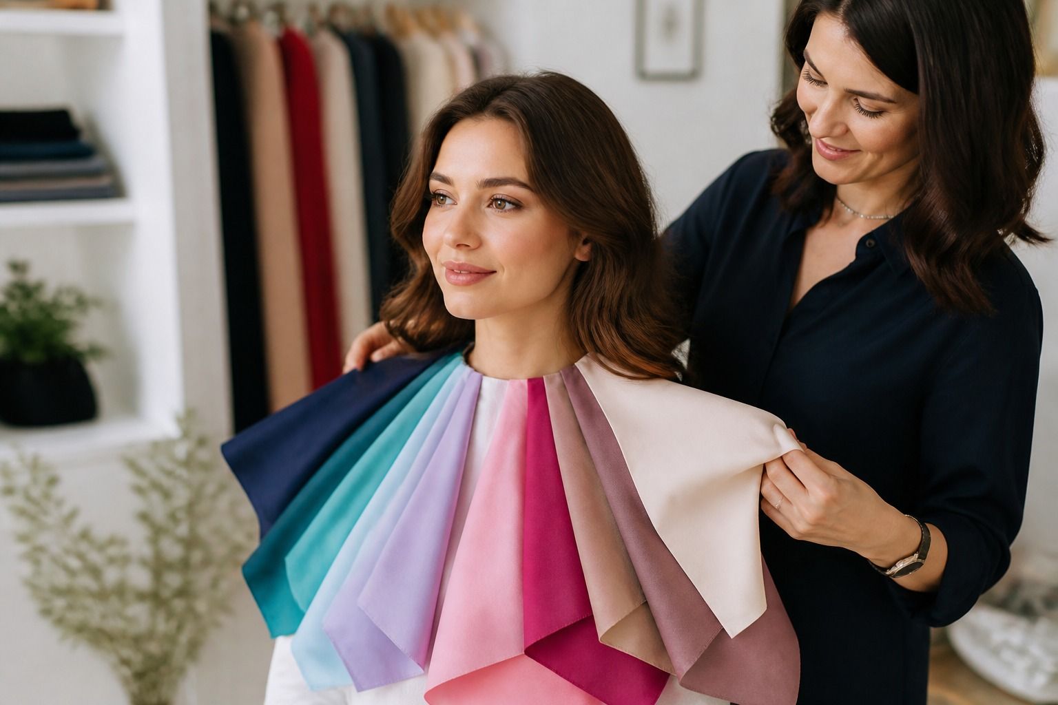
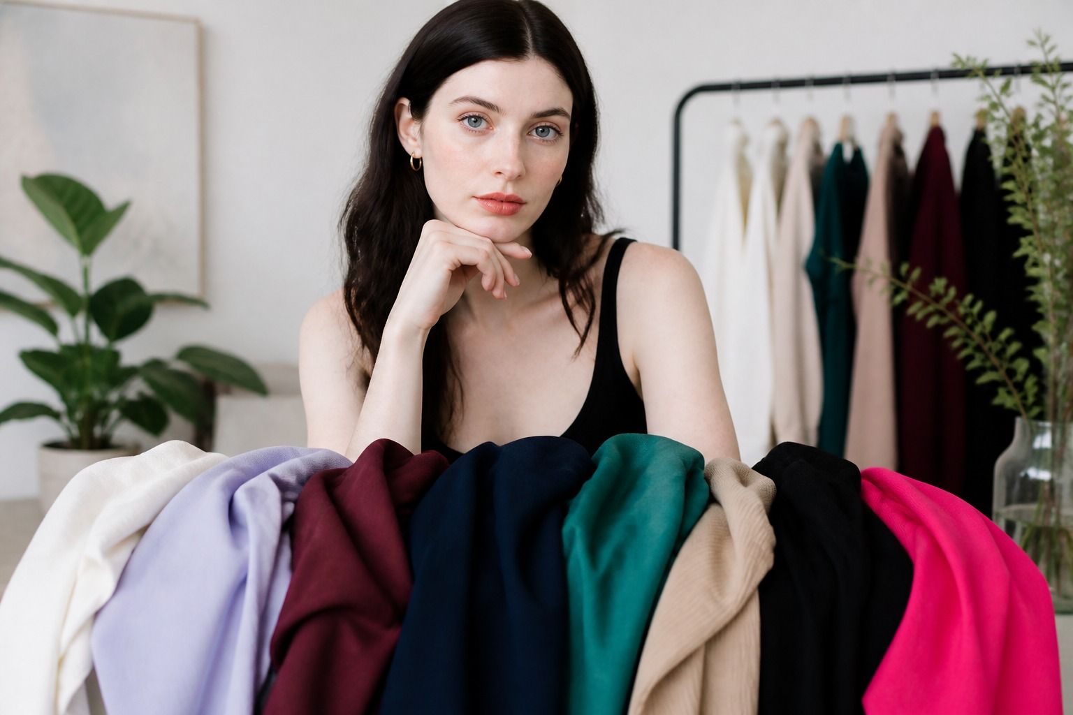
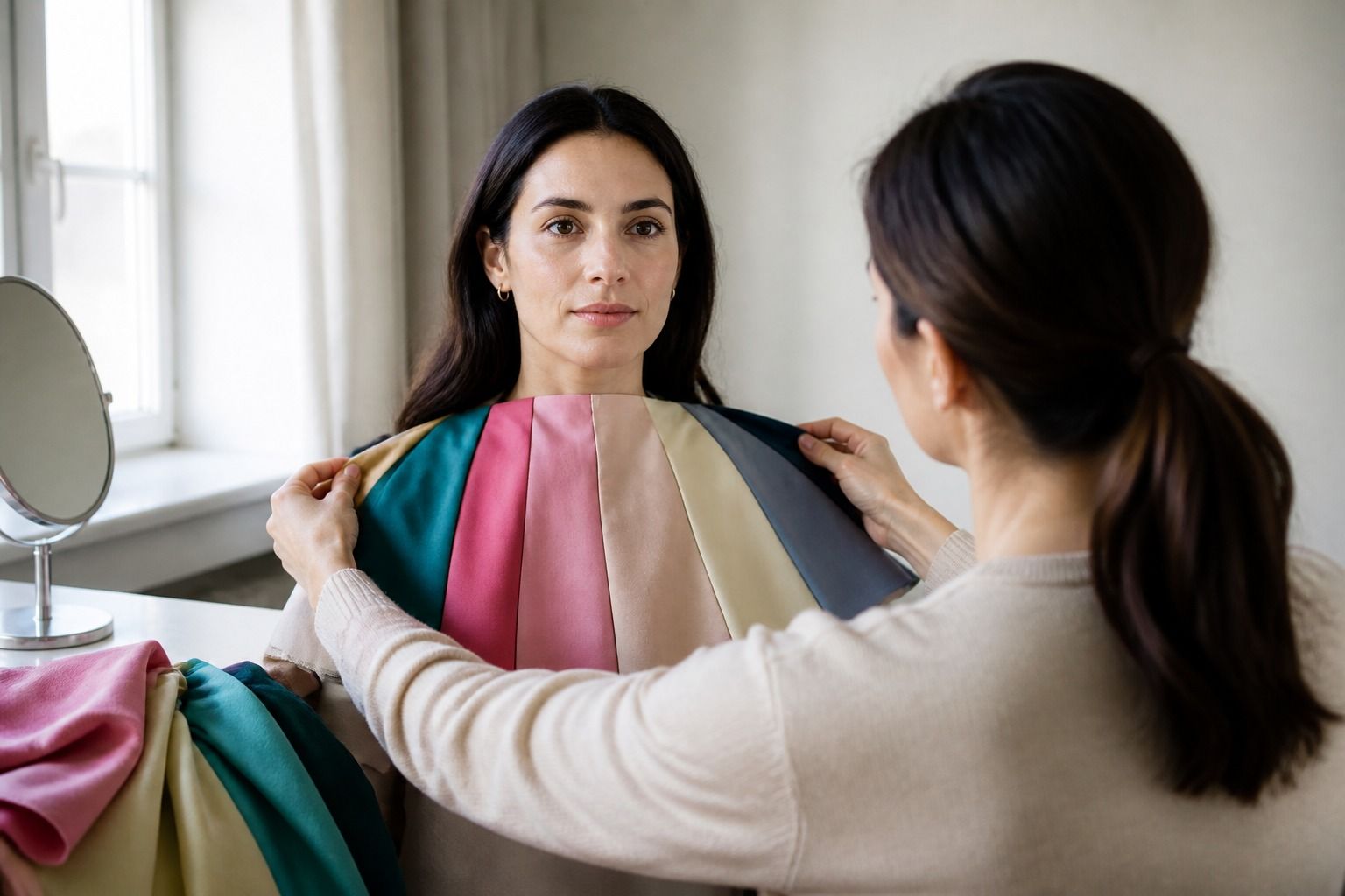
Prepare fabric rather than relying on tiny swatches. A scarf, T-shirt, pillowcase, or piece of cloth should reach from the shoulders to the upper chest so the color frames the face. Make a simple group: soft white, cream, navy, black, medium grey, a warm red, a blue-red, muted green, and clear turquoise. You are building evidence. There is no need to own a professionally arranged set of drapes to start.
Before you begin, take one neutral reference photo from the same distance you will use later. Do not edit it. Check that the phone is not using a beauty filter or portrait mode, and lock exposure if your camera allows it. The reference is only there to show whether the room changed, not to identify an undertone from pixels.
Use fabric and clothing comparisons
Place one color below the chin, then add its comparison partner without moving your body or changing the light. Look for a few seconds, look away at the neutral wall, and return. This reset helps because the eye quickly adapts to an intense shade. Compare similar colors first when possible. Cream versus icy white tests temperature and brightness more cleanly than cream versus purple.
| Pair to try | What the pair can show | Common complication |
|---|---|---|
| Cream and soft white | Whether warmth or a cooler near-neutral feels calmer | Very yellow cream can overpower anyone |
| Navy and black | Whether depth is useful without maximum contrast | Fabric finish changes how dark each one appears |
| Peach and blue-red pink | Whether warm or cool pink supports the face | One shade may simply be much brighter |
| Olive and blue-green teal | Whether muted warmth or cooler clarity is easier | Green reflects nearby colors strongly |
| Gold and silver fabric | A broad temperature clue near the face | Shiny surfaces can distract from the color itself |
Do not ask whether a color is beautiful. Ask what it does to the whole face. In a supportive shade, the boundary around the jaw may look quieter, the eyes may become easier to see, and the mouth may appear more even in color. In a difficult shade, the fabric may arrive before the person: you notice a yellow, grey, or overly pink cast, or the shadows under the eyes seem stronger. These are observations, not judgments about skin.
Hold the fabric close enough to test a blouse but far enough that it does not cast a shadow. A shiny satin and a matte cotton in the same color will behave differently. Record the color family, the depth, and the finish. If a muted teal works in cotton but a highly reflective teal looks loud, the conclusion may concern chroma or surface, not temperature.
Keep notes in plain language. Write warm red is heavy beside my face, blue-red is clearer, medium navy works, pale beige disappears, or bright turquoise needs a darker layer. Notes like these are more useful at a shop than a single season name, especially when your result sits between two neighboring palettes.
Read the effect on the whole face
Most people fixate on one clue, usually the skin. Try to widen the view. Does the color make the eyes look brighter or simply more contrasted? Does it repeat a natural color in the lips or hair without creating a costume effect? Does the face keep its shape, or does the garment pull attention down to the chest? A good comparison often feels quiet. You may notice the person first and the fabric second.
Check the forehead, cheeks, jaw, and neck together. The neck can be a different surface color from the face, especially after sun exposure or skincare. Foundation can make that difference more pronounced. A color that matches the cheek alone may still look wrong around the jaw. Use the mirror first, then step back and see how the full outfit reads at shoulder distance.
Look for consistency across more than one color. If navy, smoky blue, and cool berry all work while vivid orange-red does not, there is a pattern worth testing. If only one exact shade looks excellent, you may be responding to value, fabric, or personal preference rather than a broad temperature family. A color analysis test becomes more reliable when several related observations point in the same direction.
It is also fine to find a color pleasant but unhelpful near the face. Put it in trousers, a skirt, a bag, or shoes. Personal color analysis is about choosing placement as much as choosing a color. A shade that makes the face look slightly flat can still be the right shade for a coat if a shirt or scarf creates a better frame underneath.
Know what a phone photo can distort
A color analysis test photo is convenient, but a phone does a surprising amount of interpretation before you see the result. Auto exposure may brighten a dark shirt and wash out the face. White balance can turn a cool room warm or a warm room pink. HDR can lift shadows that would be visible in the mirror. Front-facing cameras may also change skin texture and proportions, while a filter can quietly smooth or recolor the image.
For a more useful record, place the phone on a stable surface, use the rear camera if possible, and keep the distance, light, and background fixed. Photograph the same comparison pair in one short session. Do not compare a navy photo taken at noon with a cream photo taken after sunset. If the camera keeps changing the exposure, use the images only as a reminder and give the mirror more weight.
Digital colors on a screen are another weak point. A red blouse photographed by one phone may look orange on another display. A fabric can also reflect window light into the lower face, creating an effect that a flat color rectangle cannot reproduce. Online palettes are helpful for collecting ideas, but they cannot replace fabric held near your own face.
Repeat the test on a different day if the result is surprising. Keep the same neutral background, use the same small group of fabrics, and begin with the pair that gave the clearest answer last time. If the result changes completely, look for a setup problem before deciding that your coloring is mysterious. Light and camera settings are usually more changeable than you are.
When an in-person drape is worth it
Home testing is often enough to choose better neutrals and to stop buying shades that consistently drain the outfit. An in-person draping session becomes more useful when several color families look equally plausible, when your contrast is difficult to judge, or when you keep getting opposite results from photos and mirrors. A trained observer can control the fabric sequence and notice small changes while you stay still.
Bring your home notes rather than expecting someone else to erase all uncertainty. Mention the colors you wear often, the colors you dislike, and the situations where a garment felt wrong. A useful session should explain the reason behind a result: perhaps medium depth matters more than temperature, or muted colors work better than clear ones. A long list of exact shades without an explanation is hard to use when shopping.
Be cautious with any method that promises a perfect answer from a single photograph or treats a seasonal label as permanent identity. Hair dye, tanning, makeup, clothing contrast, and lighting can change the impression of a test. Your response to color can also be close to a border between palettes. The aim is a dependable set of comparisons, not a dramatic reveal.
Finish by choosing three colors you will test in real life during the next week. Wear each near the face in ordinary daylight, then notice it under indoor light, beside denim, and with your usual shoes. If the color still feels balanced after a full day, it has earned a place in your working palette. That is a better result than a confident label that never leaves the screen.