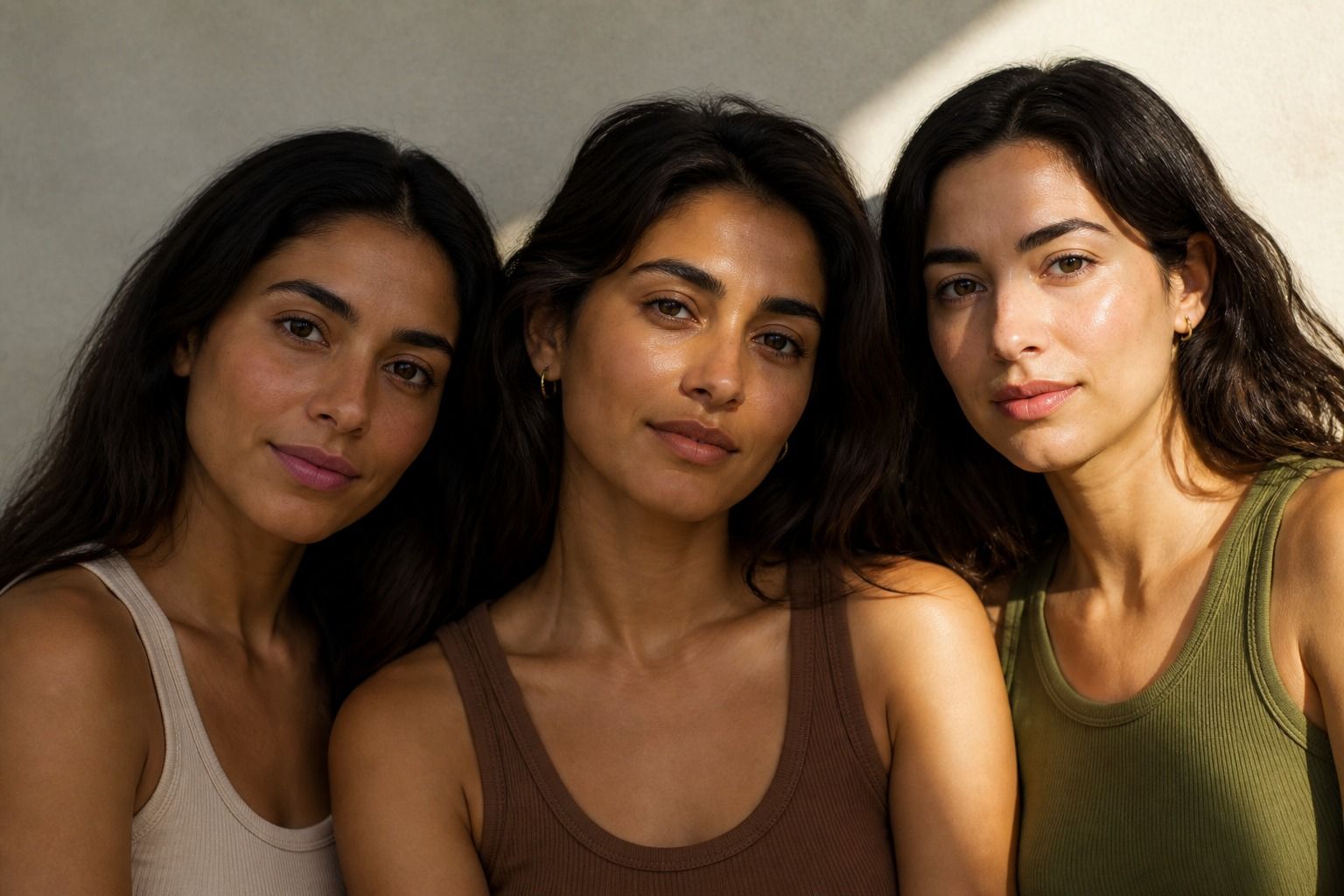
Olive skin is often difficult to place because it can look beige, golden, green, grey, or rosy depending on the light. That shifting appearance does not mean the skin has changed. It means several things are being seen at once: surface color, depth, redness, and undertone. The useful question is rarely whether every olive complexion is warm or cool. It is which direction your olive coloring leans, and which clothing colors make that direction easier to see.
Why olive skin is easy to misread
Olive describes a muted quality as much as it describes temperature. Many olive complexions have a subtle green or grey cast that sits between the usual warm and cool examples. A fair olive face may look yellow beside a pink foundation but grey beside a true golden shade. A medium olive complexion can look warm in late afternoon and cooler under a north-facing window. Those observations can all be true.
Surface redness adds another layer. Acne, irritation, flushing, sun exposure, or a strong pink tone at the cheeks can make the face appear cool even when the overall undertone is warmer or more neutral. The color around the eyes can also mislead you. This is why an undertone test should never become a judgment about health or circulation. It is a styling comparison, not a medical diagnosis.
The first practical clue is mutedness. Warm olive often has a green-gold or yellow-green cast, while cool olive may have a green-grey cast and can sit comfortably beside blue-based colors. Neutral olive may move between both groups without looking clearly yellow or pink. These are tendencies, not boxes. The same person may prefer different temperatures at different levels of contrast or in different fabrics.
Look for a muted green or grey cast
Begin in indirect daylight with a clean face or the lightest makeup you can manage. A white wall, a grey top, or a plain towel makes a better background than a bright colored room. Avoid judging under a warm bathroom bulb. It can add yellow to almost everyone and make the experiment feel more certain than it is.
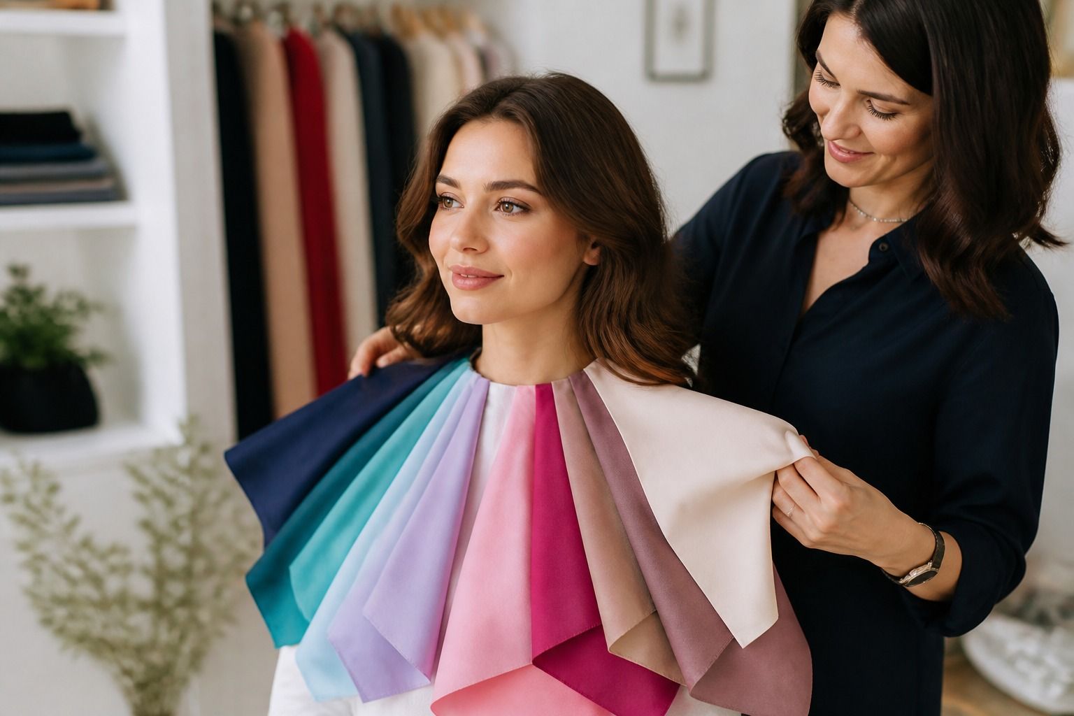
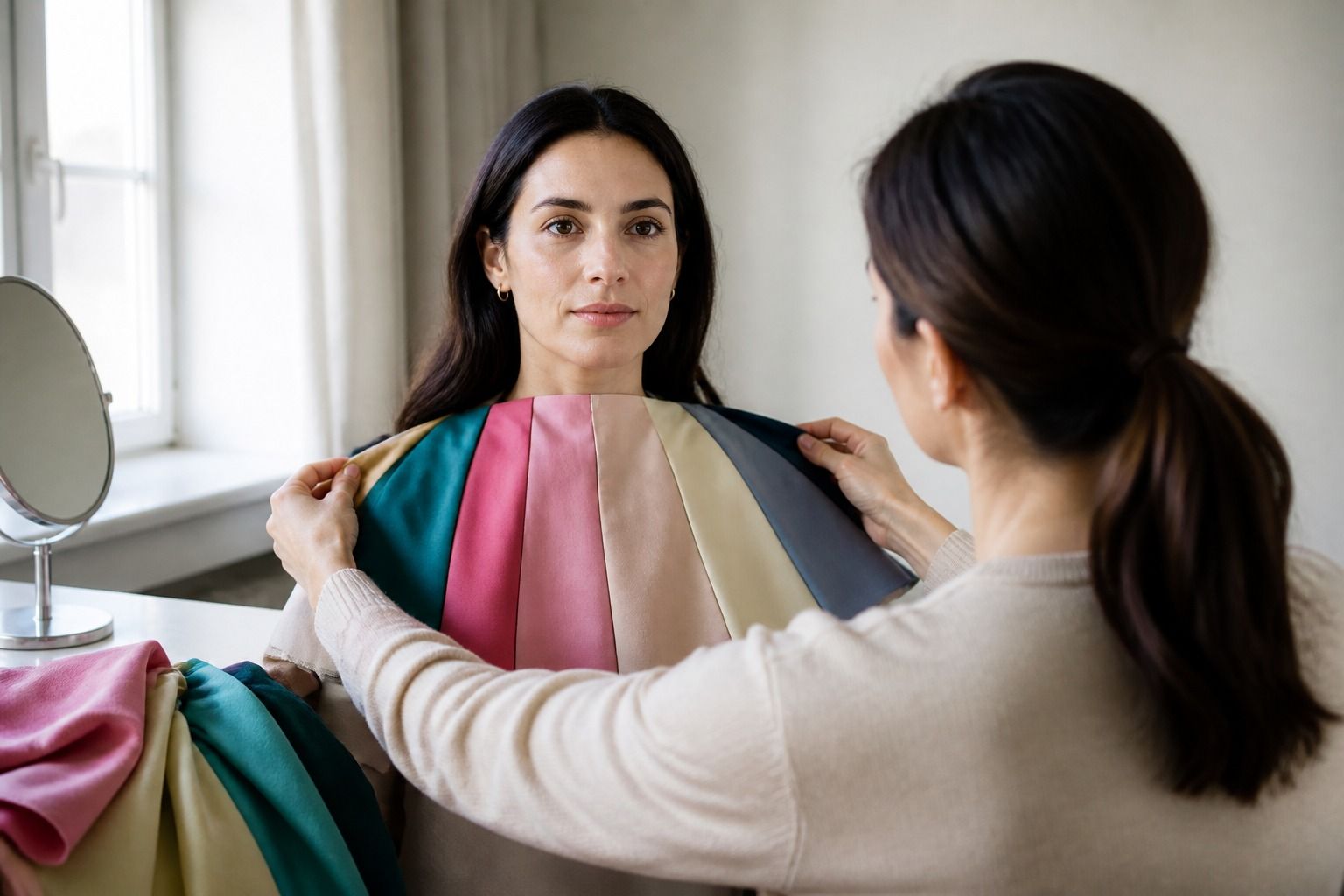
Hold a cool white fabric and a soft cream fabric beneath the chin, then compare a neutral grey with a camel or warm beige. Do not ask which swatch looks prettier. Ask which one makes the face look more even, and which one makes the cloth look separate from you. On olive skin, a bad match may turn greenish, too pink, too yellow, or simply dull. The change can be quiet, so move the fabrics away and back several times.
Next, compare a clear color with a muted version of the same family. Place bright turquoise beside smoky teal, or clean coral beside muted terracotta. Olive coloring often responds better to the shaded option when the saturated one makes the skin appear grey or uneven. That response tells you about chroma, or intensity, as well as temperature. You may be dealing with muted neutral olive rather than a simple warm-or-cool split.
Phone cameras are useful for recording comparisons but poor at creating a final answer. Exposure, white balance, nearby walls, and automatic skin smoothing can change the green cast. If you take photos, keep the camera in the same position, use the same daylight, and compare several pairs in one session. A photo that looks convincing on one screen should still be checked in a mirror.
Separate cool, warm, and neutral olive
Think of the three descriptions as directions on a dial. Warm olive leans toward yellow, gold, rust, and warm earth colors, but it still keeps the muted quality that makes olive different from clear golden skin. Cool olive leans toward grey, blue, purple, and cooler berries. Neutral olive can work with both, yet often needs a controlled level of saturation because very clear colors can look louder than the face.
| Olive direction | Clues worth testing | Useful comparison |
|---|---|---|
| Warm olive | Green-gold cast, earthy colors look integrated, warm cream is easier than icy white | Rust beside blue red, camel beside cool taupe |
| Cool olive | Green-grey cast, blue red or plum feels clean, yellow beige can look sallow | Cool burgundy beside orange red, charcoal beside camel |
| Neutral olive | Both temperature groups can work when muted, very bright colors may dominate | Soft white beside cream, smoky teal beside clear turquoise |
Fair olive and medium olive can occur in any of these directions. Depth changes how much contrast a color creates, but it does not settle the undertone. A deep cool olive person and a fair cool olive person may both prefer blue red, yet one may need a richer version and the other a softer one. Avoid turning complexion depth into an assumption about temperature.
Also keep the word olive separate from the word green. Greenish cast is a clue, not a color prescription. Some people with an olive undertone look best in soft neutrals and cool berry shades, while others look better in moss, rust, and warm teal. The starting observation is similar, but the working palette depends on contrast and intensity too.
Test colors instead of relying on veins alone
Veins can be one small clue. Green-looking veins may suggest warmth, blue or purple veins may suggest coolness, and mixed veins are common. Skin thickness, lighting, and the color around the wrist can affect what you see. For olive skin, a green or purple vein pattern often confirms that the undertone is mixed or muted rather than giving a clean answer. Use the wrist test to choose the next comparison, not to close the case.
Jewelry creates another comparison, but gold versus silver is not a pass-or-fail exam. Yellow gold may harmonize with warm olive, while silver, pewter, or white gold may feel cleaner on cool olive. Neutral olive may enjoy both, especially when the metal is not placed right under the chin. Compare similar pieces in the same light and notice whether one makes the skin look clearer or simply grabs more attention.
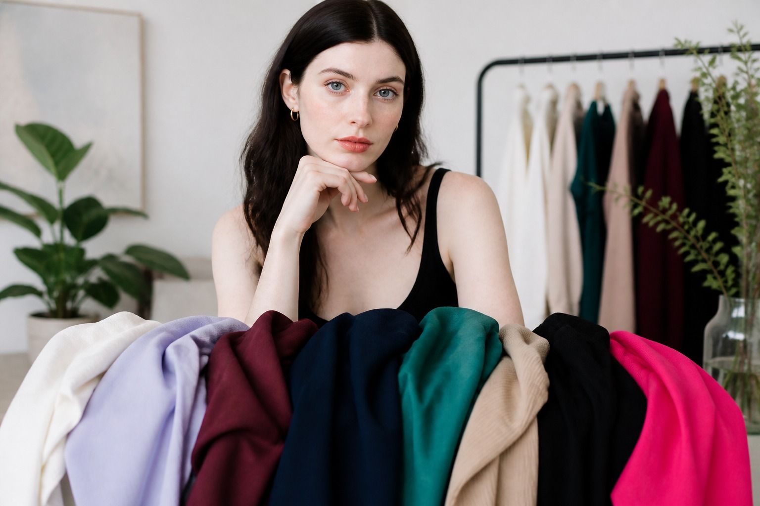
Clothing is often the most useful test because it shows the effect across a larger area. Put a cream shirt beside a soft white shirt, then compare a warm brown with a charcoal or cool taupe. Try muted teal against bright turquoise and plum against orange red. The best choice usually leaves the skin looking steady while the color remains visible. A poor choice may exaggerate shadows, pull attention to redness, or make the complexion look grey.
Foundation mismatch can be a practical warning sign, but it does not identify a guaranteed shade. If common warm foundations look orange and cool foundations look pink, you may be noticing olive or neutral coloring. If a product looks correct on the hand and wrong on the face, that is a clue about the difference between surface color and undertone. Test any cosmetic in daylight and allow for the fact that brands use different naming systems. Clothing comparisons are safer and more informative for personal color work.
Repeat the test on a day when you are not flushed, immediately after exercise, or standing beside a colored wall. Change only one comparison at a time. If the result changes with every room, stop looking for a perfect label and focus on the colors that stay usable across conditions.
Choose clothes when the undertone is mixed
A mixed undertone does not require a wardrobe split into warm and cool halves. Start with near-neutrals that sit comfortably between temperatures. Soft white, mushroom taupe, charcoal, muted navy, olive grey, and chocolate brown can all be useful, depending on your depth and contrast. The best neutral is the one that gives your face enough definition without making the skin look dusty or yellow.
For a cool olive wardrobe, try smoky teal, blue red, cool burgundy, plum, pine, and softened navy. For warm olive, test moss, forest green, terracotta, rust, camel, warm cream, and chocolate. Neutral olive can borrow from both lists, but muted versions may be easier than very clear turquoise, lemon yellow, neon pink, or icy lavender. This is a guide to the first rack of clothes you try, not a ban on colors you enjoy.
Keep uncertain colors away from the face while you decide. A warm mustard skirt may work even if mustard near the face feels heavy. A cool lilac bag can add interest without forcing the shirt to carry it. Scarves, collars, glasses, and earrings need closer testing because they create a strong frame. Jackets and trousers give you more freedom to use a shade that is attractive but not ideal as a top.
When two colors both seem workable, compare the outfit rather than the swatch. A cool olive person may wear a warm brown successfully when it is balanced with a blue-red scarf. A warm olive person may make icy grey easier with rust, gold, or a warmer texture nearby. Neutral olive often benefits from repeating one muted quality across the outfit, such as smoky teal with charcoal and soft white. Harmony is usually about the relationship between pieces, not a single correct temperature.
There is no need to force olive skin into a warm or cool identity after one test. Look for a pattern across daylight, fabric, jewelry, and real clothes. If the same colors keep making the face look balanced, you have enough information to shop well. The useful result may be cool olive, warm olive, neutral olive, or simply a short list of colors that behave consistently. That practical list is more reliable than a label that asks you to ignore what you can see.