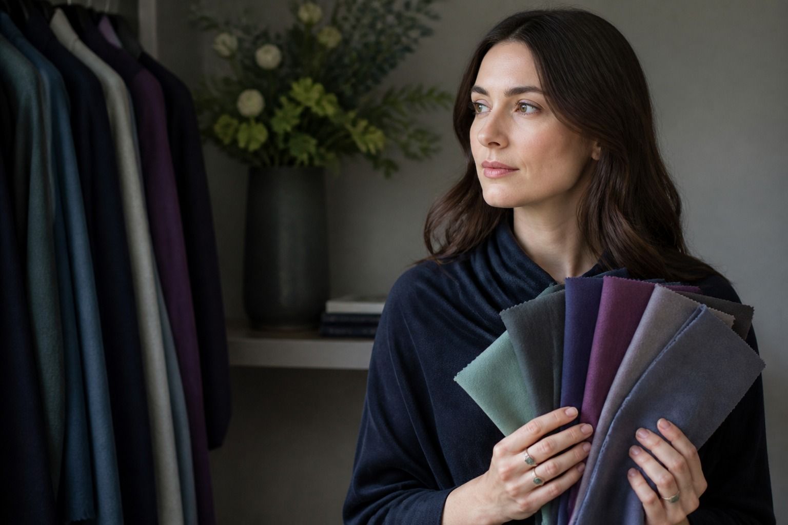
A Deep Summer palette sits in the part of the Summer family where soft colors need a little more weight. Think smoky navy rather than powder blue, plum rather than pale lilac, and a cool berry that has been toned down instead of sharpened into neon. The name is not used in exactly the same way by every color analysis system, so the useful question is not whether a chart has placed you in a perfect box. It is whether cool, muted, medium-to-deep colors make your face look balanced while brighter or warmer versions ask too much of it.
What makes Deep Summer different
Deep Summer is generally described by three qualities: cool temperature, subdued chroma, and more depth than the light end of Summer. The colors have a blue, rose, or violet direction, but they are softened with grey rather than made crisp and electric. They can look serious without becoming heavy. A smoky navy coat, muted raspberry top, or blue-green scarf can frame the face with enough presence while leaving the eyes and skin visible.
The word deep can be misleading. It does not mean that every dark color works, and it does not identify a person by hair color or skin depth. It describes the amount of visual weight the palette can carry. Deep Summer colors are often medium-deep, not simply blackened. When a shade becomes very dark, very warm, or extremely clear, it may leave the Summer family even if it looks attractive on a swatch.
Compared with Soft Summer, Deep Summer usually needs more contrast and richer color. Soft Summer may prefer misty blue, faded rose, and light mushroom. Deep Summer can keep the same cool and muted character while moving toward charcoal, aubergine, smoky teal, and darker berry. Compared with Deep Winter, it is quieter. Deep Winter often tolerates cleaner black, strong white, and jewel-like colors that make a Deep Summer outfit look harder.
Some consultants use Deep Summer as another name for Dark Summer, while others treat it as a bridge between Summer and Winter. That difference is worth knowing before you buy a palette card. Read the examples and the explanation of temperature, chroma, and value. A title by itself cannot tell you whether a consultant means cool and soft or simply dark.
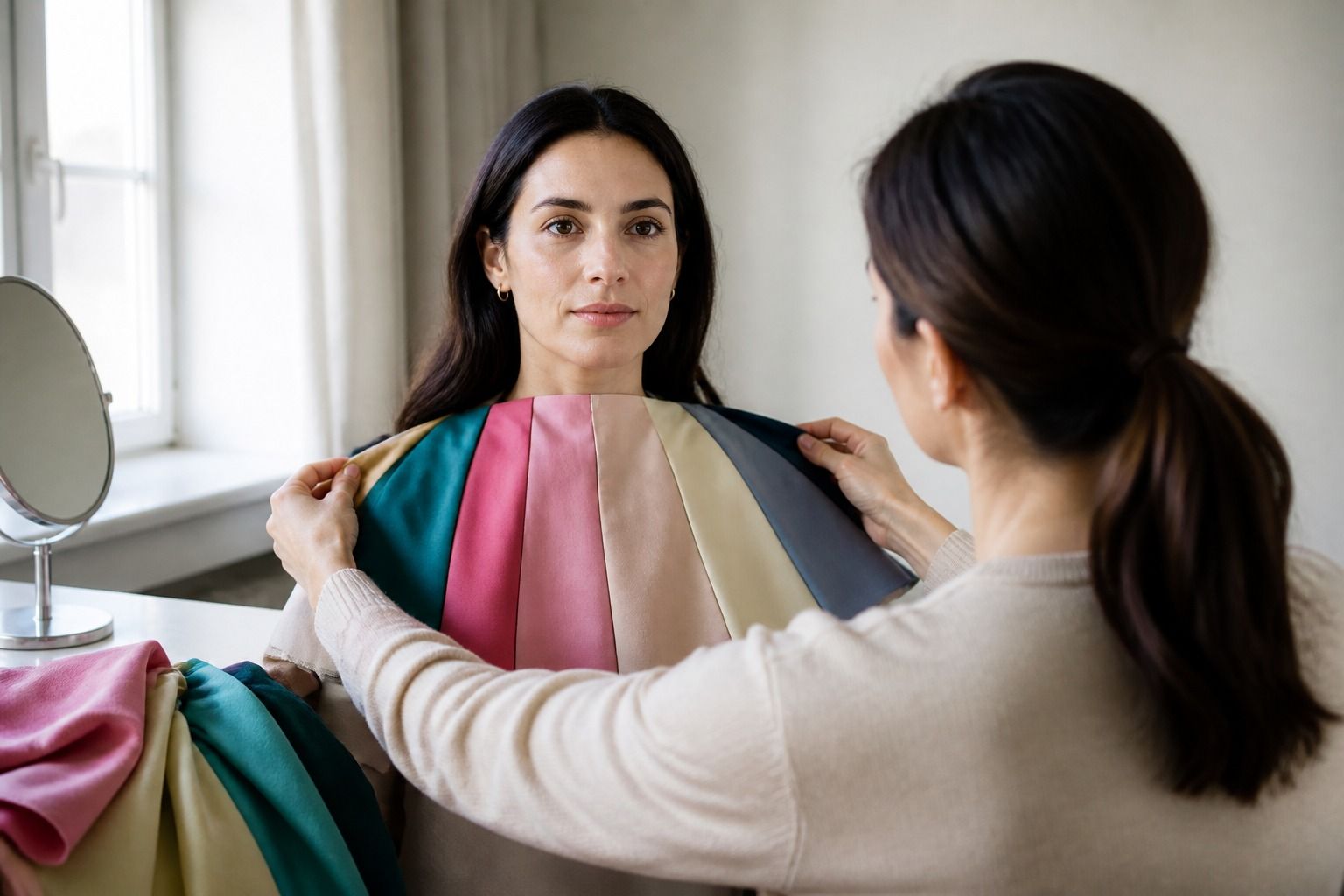
Use the palette as a way to choose fabric near the face. A deep cool color may be excellent for a sweater and still need a softer version when it appears in a glossy, high-contrast print. Texture, finish, and scale change the effect. The color on the label is only the beginning of the test.
Choose depth without turning bright
Deep Summer works best when depth comes from a softened color rather than from adding black until the shade becomes severe. Smoky navy is often easier than pure black. A muted plum can be more natural than a bright violet. Blue-red berry may sit well where a clear cherry red feels too sharp. The colors still have presence, but their edges are slightly blurred.
Try a simple three-step comparison with one hue. Lay out pale dusty rose, medium cool rose, and a clear hot pink. Or compare misty blue, smoky navy, and electric cobalt. If the medium or deeper muted version lets your face remain the focus, you are learning something about both depth and chroma. If only the deepest shade works, check that it is not merely making the outfit look more dramatic than the face.
Brightness and depth are different controls. A dark color can be muted, such as charcoal, or clear, such as intense cobalt. A light color can be soft, such as dusty blue, or bright, such as icy turquoise. Deep Summer usually benefits from the first option in each pair: enough depth to avoid disappearing, enough softness to avoid looking painted on.
Warm dark colors are the common trap. Rust, mustard, orange-red, and golden brown can look rich in a shop mirror but bring a yellow or tired cast to a cool complexion. You do not have to remove them from the wardrobe. Move them into shoes, bags, trousers, or printed pieces, then keep a cooler top or scarf close to the face. The same color can be manageable at a distance and difficult at the collar.
Black is another useful test rather than a forbidden color. A matte black jacket with an open neckline may work because it creates space between the face and the fabric. A solid black turtleneck can create too much separation. Try black beside smoky navy and charcoal, then judge the amount of adjustment you need. If lipstick or a bright necklace has to rescue the shirt every time, a softer dark is probably the easier choice.
Best neutrals for everyday clothes
Neutrals make a Deep Summer wardrobe practical. Charcoal is usually more forgiving than flat black, especially in wool, jersey, or brushed cotton. Smoky navy gives you a dark base with a cool cast. Blue-grey, graphite, mushroom taupe, and cool cocoa can fill the middle of the wardrobe. Soft white is often easier than optic white when the overall palette needs quiet contrast.
| Neutral to try | Why it can work | Good pairing | Watch for |
|---|---|---|---|
| Charcoal | Deep enough for structure without hard black contrast | Cool rose or muted teal | Very blue graphite may look stark in shiny fabric |
| Smoky navy | Dark, cool, and softer than black | Berry, plum, or soft white | Warm navy can turn muddy near the face |
| Blue-grey | Bridges a medium shade and a cool neutral | Muted raspberry or charcoal | Pale grey may lack the depth you need |
| Mushroom taupe | Quiet and useful when beige feels too yellow | Smoky navy or cool rose | Golden taupe can pull the complexion warm |
| Soft white | Creates light without the shock of optic white | Plum, blue-green, or charcoal | Yellow cream can compete with the cool palette |
When shopping for neutrals, compare the fabric to your face and to a known good color. A taupe sweater may look neutral on a rack but lean yellow under warm store lights. Take it near a window or photograph it beside charcoal. The aim is not to find a perfect neutral name. It is to see whether the fabric makes your face look even and whether it can work with the rest of your clothes.
Use the darkest neutrals where you want structure: trousers, coats, boots, and bags. Put the most reliable ones into tops, scarves, and collars. If a color is borderline, let it sit farther away. This simple placement rule gives you more freedom than a list of colors you are supposedly allowed to wear.
Patterns need the same treatment. A small print that mixes charcoal, dusty rose, and soft white may be excellent even if one of its threads is slightly warm. A large pattern with black, optic white, and bright turquoise may create too much contrast. Consider the overall impression from normal speaking distance, not each thread under a shop spotlight.
Accent colors that keep the palette cool
Deep Summer accents are strongest when they bring color without becoming loud. Cool rose works well in shirts, knitwear, and lipstick-free outfit tests because it has enough warmth to feel alive but still keeps a blue or pink direction. Plum, aubergine, and muted berry add depth for evenings. Smoky teal and blue-green give a wardrobe more variety than another neutral while staying calmer than emerald.
Try a charcoal trouser with a cool rose knit and a smoky navy coat. The outfit has contrast, but the edges are softened. For a darker combination, use an aubergine blouse with blue-grey trousers and a soft white shoe or bag. If you want more color, muted teal beside charcoal gives definition without the hard jump that clear turquoise can create.
Reds deserve comparison because the useful version is easy to miss. Blue-red, cranberry, raspberry, and cool wine can sit comfortably in a Deep Summer palette. Tomato, orange-red, and warm brick may need more distance. Hold the swatches below the chin and check whether the red makes the skin look clearer or whether it creates a patch of color that you keep trying to balance.
Greens also divide quickly. Blue-green, eucalyptus, softened pine, and cool jade are worth trying. Yellowed olive, chartreuse, and bright leaf green may be too warm or clear, although a muted olive in a trouser or jacket can still be useful. A color can be outside your strongest face-adjacent range and remain valuable as part of a practical outfit.
Metal and accessories can change the result. Brushed silver, pewter, white gold, and cool gunmetal often echo the palette. A dark berry bag may be easier than a bright purple one because its surface is less reflective. If you love warm gold, try a muted or antique finish farther from the face instead of treating jewelry as a strict pass-or-fail test.
Where Deep Summer overlaps with neighboring seasons
Soft Summer is the nearest neighbor when both palettes look best in muted colors. The difference is usually depth. Soft Summer may look more rested in mid-tone dusty colors, while Deep Summer needs a darker frame to keep the face from being washed out. Compare smoky navy with misty blue, and deep berry with faded rose. If the darker version gives you presence without making the features look severe, Deep Summer may be the better working description.
Deep Winter is the other side of the boundary. Both can use dark navy, plum, and berry, but Deep Winter often handles clear contrast and cleaner saturation. Try a muted teal beside a jewel-toned teal, or soft white beside optic white. If the sharper version makes the eyes look stronger and the face stays balanced, there may be more Winter influence. If the fabric becomes the first thing you see, stay with the softer side.
Some people also compare Deep Summer with Cool Summer or True Summer. This is useful when temperature is easy but depth is uncertain. Cool Summer may prefer a more even middle range, while Deep Summer needs selected darker colors. Put medium charcoal, smoky navy, and cool rose beside lighter cool shades. Do not assume that a darker color is automatically more flattering; look for the point where the face still has room to breathe.
Lighting can make the border look different. Warm indoor bulbs push cool colors toward grey and make warm colors appear friendlier. A camera can deepen shadows or raise contrast. Check the palette in daylight, under ordinary indoor light, and in a photo taken without a filter. You are looking for a stable pattern, not identical results in every room.
Deep Summer is a useful wardrobe direction when it helps you choose cool colors with weight and restraint. Keep charcoal, smoky navy, soft white, berry, plum, and blue-green as working references, then adjust based on fabric and distance from the face. If a favorite warm or bright color still feels like you, wear it where it works best. Personal color analysis should make the wardrobe more readable, not make it smaller.