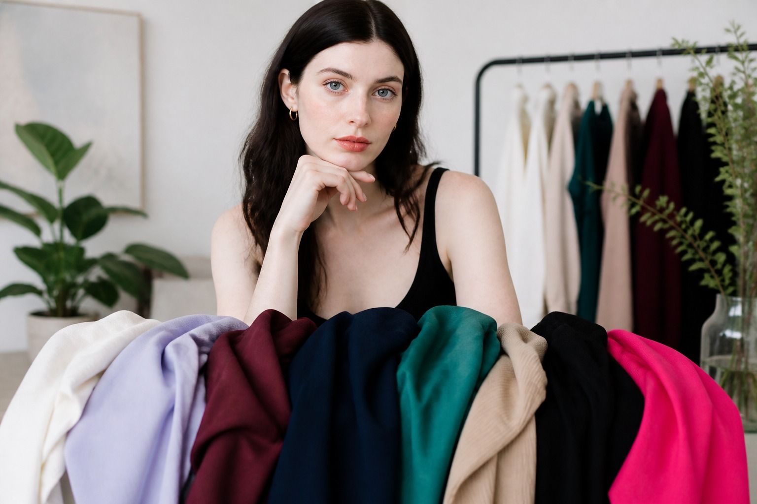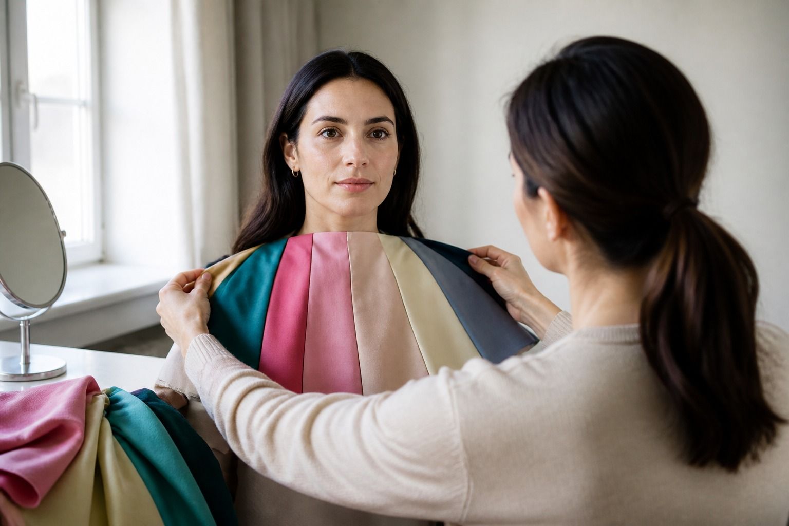
When people ask what is my color palette, they often begin with a single dramatic color: a lipstick, a favorite sweater, or a shade that looked good on someone else. That is an entertaining place to start and a shaky place to finish. A personal palette becomes useful when several observations agree, then survive contact with your actual wardrobe, your usual light, and the colors you can imagine wearing on an ordinary Tuesday.
Start with patterns instead of a favorite color
Open your wardrobe and pull out the clothes you reach for without thinking. Lay them on the bed and look for repeated qualities. Are the colors mostly light, medium, or deep? Do they look dusty, clear, earthy, blue-based, golden, or fairly neutral? Notice what you wear near your face and what stays below the waist. A black pair of jeans tells you less about your palette than the shirts that make you feel present when you are tired.
Now find the garments you rarely wear even though the cut is good. Try them on in daylight and ask what feels wrong. The problem may be the color, but it may also be the neckline, fabric shine, fit, or a memory attached to the item. A mustard shirt can seem impossible because it is too yellow and too bright, while a muted ochre could be perfectly comfortable. Keep those variables separate.
Make two small piles: colors that make getting dressed easier and colors that need help. Do not call the second pile bad colors. A shade can work with denim, a jacket, or a darker lip color and still be difficult as a plain top. You are looking for useful patterns, not collecting evidence against yourself.
Favorite colors deserve a fair test, too. Loving cobalt does not prove that clear, cool, high-chroma colors suit you, and disliking beige does not prove that all warm neutrals are wrong. Personal taste and color harmony overlap, but they are different questions. The best palette leaves room for both.
Separate warm and cool clues
Temperature is the first comparison most people make, but it works better as a range than as a switch. Test similar shades near the face: coral against blue-red pink, camel against cool taupe, warm olive against blue-green teal, cream against soft white. Keep the depth and intensity as similar as you can. If the warm shade is also much brighter, you will not know which quality caused the effect.
Look for a color that lets the face stay in charge. A supportive temperature often makes the complexion look more even and the features easier to read. A difficult temperature can create a yellow, grey, or overly pink cast, or make the garment look detached from the person. These changes may be small, especially when the fabric is textured or the room light is poor.
Undertone clues can help you choose the next comparison, but they should not end the process. Veins, jewellery, and the way you tan are all affected by context and can point in different directions. A neutral or olive complexion may respond to both warm and cool families, with mutedness or depth doing more of the work. When clues disagree, use fabric beside the face.
Keep the useful conclusion specific. I need blue-based reds near my face is more helpful than I am cool. Warm camel feels too yellow, but soft cinnamon works is more useful than I am warm. That wording allows for the middle ground where many real wardrobes live.
Estimate contrast, value, and intensity
Once you have a temperature direction, compare the scale of the color. Value is lightness or depth. Very pale skin, hair, and eyes may look balanced beside soft medium colors, while a person with deep hair and light skin may enjoy stronger light-dark separation. This is a tendency, not a rule. A soft black can be easier than stark black, and a deep navy can work even when the full black-and-white combination feels too sharp.
Intensity, often called chroma, is the difference between a clear color and a softened one. Compare bright turquoise with smoky teal, clear tomato red with brick, or electric violet with muted plum. If the clear version appears first and the face gets lost, try a quieter version before abandoning the entire color family. If muted colors make everything look sleepy, test a cleaner middle value.
Contrast applies to combinations as well as individual shades. Put a dark neutral beside a light one, then try two close values. One pairing may give your face a useful frame; the other may look more natural because the transition is gentle. Photograph both from a few steps away. A color that looks flattering close to the mirror can become visually heavy when the full outfit is visible.
| Quality | Lower or softer option | Clearer or stronger option |
|---|---|---|
| Temperature | Cool taupe, dusty rose, blue-green | Camel, coral, yellow-green |
| Value | Stone, medium grey, soft navy | Bright white, black, deep espresso |
| Intensity | Smoky teal, muted plum, brick | Clear turquoise, jewel plum, tomato red |
| Contrast | Charcoal with soft white | Black with optic white |
The table is a set of directions for testing, not a ranking of colors. A person can prefer high contrast in an evening outfit and softer contrast for work. Your strongest palette quality may also change by area: a bright scarf may work when a bright sweater feels too loud because less fabric is competing with the face.
Build a small working palette
Do not begin with forty swatches. Choose three dependable neutrals, three colors you can wear near the face, and two accents that make the wardrobe feel personal. A neutral could be navy, charcoal, soft brown, cream, taupe, or olive depending on your comparisons. Your colors might be rose, teal, forest green, berry, rust, or blue. The exact names matter less than the temperature, depth, and intensity you observed.
Include a light and a dark option if your wardrobe needs them. A palette made entirely of mid-tones can feel tasteful on paper but leave you without a coat, shoe, or evening layer. Add one near-neutral that is easy to combine with denim. Near-neutrals often do more work than highly distinctive accent shades because they can repeat across several outfits without becoming the entire story.
Build outfits from the clothes you own rather than shopping for a new identity. Try a soft white top with navy trousers, a muted green shirt with dark brown, or a blue-red knit with charcoal. Change only one element at a time. If the outfit improves when the top changes but stays the same when the shoes change, you have learned something about face-adjacent color. If the whole look feels wrong, check proportion and texture before blaming the palette.
Make a short list for shopping notes: best dark neutral, easiest light neutral, reds to try, greens to compare, colors that need distance from my face. This gives you a working palette without pretending that every future purchase must pass a test. It also prevents the common mistake of buying a perfect swatch in an impractical color.
Check the palette against real clothes
Wear the draft palette in at least three situations. Check it in indirect daylight, under indoor lighting, and in a full-length mirror. A color can look gentle at the window and much darker in an office. Notice whether the garment still feels right after several hours, when you have stopped admiring the newness of it. Clothes are tools for living, not just samples beside the cheek.
Pay attention to distance from the face. A difficult shade may be fine as a skirt, trouser, shoe, belt, or bag. A strong accent can also work as a scarf if the rest of the outfit gives it enough space. Conversely, a gentle color may lose its effect when the neckline is far from the face. The same swatch can behave differently as a T-shirt, coat, and small accessory.
Check your palette against your existing neutrals and makeup colors, without making makeup a requirement. A shirt that works with your natural face may look different when paired with a strongly warm lipstick. Hair dye can alter the apparent contrast as well. These are styling choices, not permanent changes to your coloring, so record them as context rather than treating them as the final answer.
If you keep finding exceptions, refine the rule. Perhaps you do not need cool colors; you need cool, softened colors. Perhaps black is fine when the fabric is matte and the neckline is open. Perhaps a warm color works below the waist but pulls yellow near the cheek. A good personal palette gets more precise as you test it, and it should become easier to use, not more restrictive.
Seasonal labels can be a useful filing system for these observations. Spring, Summer, Autumn, and Winter describe broad families, while smaller seasonal groupings describe differences in softness, depth, and clarity. You do not have to force yourself into one box. Keep the colors that repeatedly make clothing easier, leave room for personal taste, and let the wardrobe provide the final evidence.