Neutral undertone colors are often described as if they should all work equally well. That sounds convenient, but it is not how most wardrobes behave. A neutral undertone usually means the skin does not lean strongly warm or cool, so you can borrow from both sides of the color wheel. It does not mean every shade will flatter you, or that your best colors have no temperature at all. Value, intensity, contrast, fabric, and the distance from your face still matter. The practical aim is to find a flexible range that gives you options without making your complexion look dull.
What neutral undertone actually means
Undertone is the subtle temperature beneath the visible surface color of the skin. A neutral undertone sits closer to the middle than a clearly golden, peach, pink, or blue-leaning undertone. Some people appear balanced in gold and silver jewelry. Others see both blue and green in their veins, or find that warm and cool foundation families can each look plausible. These clues can point toward neutral, but none of them is a stand-alone test.
Neutral skin can still be light, medium, deep, olive, rosy, muted, or high in contrast. That is why a neutral undertone color palette cannot be reduced to beige and blush. A neutral person with deep hair and clear eyes may need stronger colors than a neutral person with a soft, blended appearance. A medium neutral complexion may look better in a rich teal than in a pale powder blue, even though both are technically cool or balanced options.
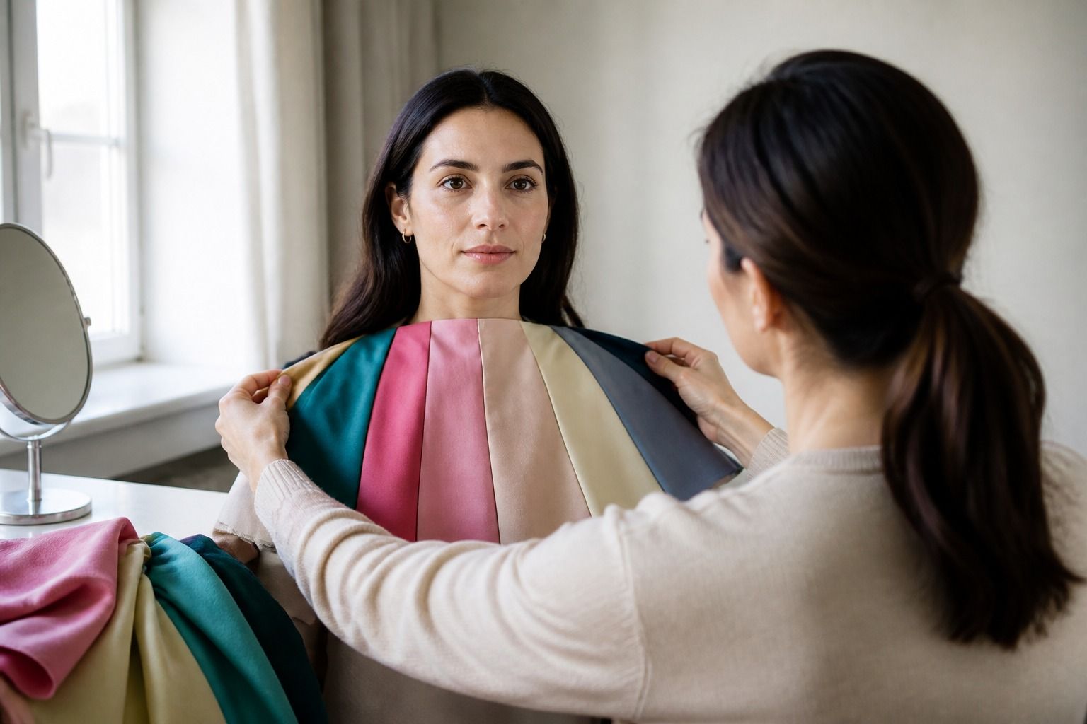
When you test a shade, watch the skin rather than the garment. Good signs include a more even complexion, clearer eyes, and a natural relationship between your face and the color. Less useful signs include whether you happen to like the color on its own or whether it is currently fashionable. A neutral undertone gives you more room to experiment, but it does not remove the need to compare.
Use temperature as a range
People often ask whether neutral skin should choose warm colors or cool colors. The better answer is to start with both, then narrow the range by looking at value and intensity. Warm colors include camel, terracotta, rust, mustard, coral, and olive. Cool colors include navy, mauve, blue-red, lavender, charcoal, and blue-green. Each group contains easy versions and difficult versions for the same person.
Temperature is also relative. A greyed rose may feel cool next to coral but warm next to icy lilac. Taupe can lean pink, yellow, green, or grey. Navy can look almost black, smoky, or noticeably blue. This is why names on labels are unreliable guides. Put two close shades together and you can often see the direction more clearly than you can by looking at either one alone.
| Color family | Versions worth trying | Common problem to watch for |
|---|---|---|
| White and cream | Soft white, oyster, clear cream, pale stone | Yellowed cream can look heavy; icy white can make the face look grey. |
| Blue and green | Denim, navy, teal, eucalyptus, softened jade | Very dusty colors may flatten a muted complexion; very clear colors may dominate. |
| Pink and red | Rose, raspberry, coral, brick, blue-red | A color that echoes surface redness may look less balanced than it did on the hanger. |
| Brown and beige | Taupe, cocoa, chestnut, camel, chocolate | A close match to the skin can remove definition, especially in matte fabric. |
The easiest warm-cool experiment is to compare a pair with similar depth. Try muted rose beside muted coral, or navy beside olive, rather than comparing a pale cool shade with a dark warm one. If one wins, you have learned something about temperature. If neither works, the problem may be value or intensity instead.
Choose neutrals with enough life
Neutral basics are supposed to make dressing simple, yet they are often the reason a neutral complexion looks flat. A top that sits too close to your skin in value can blur the line between face and clothing. A top with the wrong temperature can add a grey, yellow, or pink cast. The fix is not always a stronger accent color. Often it is a more deliberate neutral.
Soft black is a useful alternative when full black feels too severe. Navy brings structure and usually gives more color information than black. Charcoal can be calm without being blank, while chocolate adds warmth without the orange cast of some camel shades. Taupe is flexible, but its undertone matters. Pink taupe may suit a cooler neutral complexion; mushroom taupe can work for muted coloring; a golden taupe may feel better when the skin and eyes handle warmth.
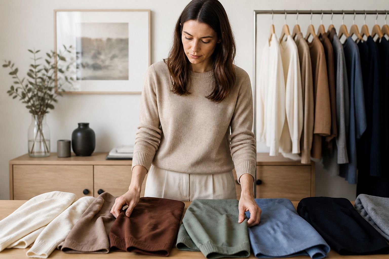
Try three neutrals at the neckline in the same light: one light, one medium, and one dark. This isolates value from temperature. If all three look lifeless, test a clearer fabric or a more defined contrast. If the medium neutral works best, make it the foundation of your wardrobe and use the other two in smaller areas. You do not need to find one universal best color for neutral skin tone. You need a dependable group of colors that cooperate.
Texture changes the result as well. A flat beige T-shirt can disappear against the face, while a beige cable knit or a patterned shirt that includes beige may look intentional. Matte charcoal may be quiet; satin charcoal may reflect enough light to look much stronger. Before rejecting a color, check whether the cut, texture, neckline, and surrounding colors are creating the problem.
Mix warm and cool accents intentionally
A mixed wardrobe is one of the advantages of a neutral undertone, but mixing does not mean throwing every temperature together. Begin with a stable neutral and add one accent that has a clear reason to be there. Navy trousers with a warm rust sweater can look grounded when the rust is repeated in a belt or shoe. A camel coat over a rose top can work when the rose is muted rather than icy. Olive with berry is often more interesting than olive with another shade of green, provided the two colors have compatible depth.
Accessories are a low-risk place to test the balance. If gold near your face makes the skin look warmer and silver makes it look clearer, try both and notice whether the difference comes from temperature, shine, or contrast. A warm leather bag can support a cool outfit without changing the color next to your face. A rose scarf can soften a dark neutral more directly than a rose handbag. The closer the color is to the face, the more carefully you should judge it.
Patterns can solve the problem of choosing between two good temperatures. A checked shirt with navy, cream, and camel may link warm and cool pieces that seem separate in a shop. A floral print can contain both rose and olive without making either one carry the entire outfit. Look for a shared quality such as similar depth or mutedness. Colors do not have to match exactly, but they should feel as if they belong to the same conversation.
Some combinations still fail. Warm mustard beside a very pale cool pink can make one shade appear dirtier. Icy lavender with yellow camel may look accidental if both are very clear. If a mixed outfit feels unsettled, change one variable first. Keep the temperature contrast and lower the intensity, or keep the intensity and bring the values closer. Small changes are easier to pinpoint than replacing the whole outfit.
Find your strongest colors through comparison
A personal color analysis can suggest a season, but a neutral undertone often sits near a boundary between palettes. You may borrow from Soft Summer, Soft Autumn, Light Spring, or another neighboring group depending on your value and chroma. The label matters less than the recurring pattern. Maybe medium, slightly muted colors consistently make the skin look even. Maybe clear jewel tones sharpen your features, while dusty shades leave you looking tired. Those observations are more useful than forcing yourself into a single box.
Set up a small home test with a window, a mirror, and clothes or fabric in comparable pairs. Wear a plain top and keep the background neutral. Compare soft black with navy, taupe with camel, rose with coral, and olive with teal. Change only one pair at a time. Do not judge under yellow lamps, and do not rely on a phone screen to reproduce the exact color. If you photograph the comparison, keep the camera in the same position and treat the image as a record, not proof.
Give each shade a practical note. Write even, brighter, more shadow, redder, yellowed, dull, or too strong. Also note distance from the face and the kind of fabric. A color that works in a wool coat may be too heavy in a thin jersey top. A shade that fails as a turtleneck may be fine in earrings or trousers. This record turns neutral undertone colors into actual shopping rules instead of an endless search for a perfect palette.
When shopping, buy the version that solves a real wardrobe problem. Choose a navy that works with your denim, a taupe that supports your shoes, or a rose that can sit under the jackets you already own. Neutral coloring gives you permission to move between warm and cool choices, not a duty to own everything. Keep the shades that make your face look balanced and your mornings less complicated. Let the rest stay on the rack, even if a chart says they are theoretically neutral.