Personal color analysis is easiest to understand as a way of observing color relationships. A shade of blue can make a face look rested, grey, or slightly disconnected depending on its temperature, depth, and intensity. The point is not to find a rule that governs every purchase. It is to notice which colors support your natural coloring, which ones need distance from the face, and which supposed mistakes are harmless when you genuinely like the garment.
What personal color analysis actually measures
A useful analysis looks at several qualities at once. Temperature asks whether a color leans warm, cool, or fairly balanced. Warm colors often carry yellow, red, or golden influence; cool colors tend toward blue, pink, or blue-red. Value describes lightness and depth, so pale ice blue and deep navy are different even though both are cool. Chroma describes intensity. A clear turquoise has more chroma than a dusty blue-grey.
There is also contrast: the visible difference between your skin, eyes, and hair when they are seen together. Someone with dark hair and very light skin may be able to wear a sharper jump between light and dark. Someone whose features sit closer together in value may look more at ease in blended combinations. This is a visual relationship, not a score and not a statement about what a person should look like.
That distinction explains why a quick quiz can feel oddly convincing and then fail at the shop. It may identify a broad temperature while missing the softer, deeper, or brighter quality that matters more in a particular garment. A lipstick-red sweater and a muted brick sweater can both be described as warm reds, yet one may dominate the face while the other settles into the outfit.
Why undertone is only one clue
Undertone is useful, but it has been asked to carry too much responsibility. It refers to a relatively persistent color influence beneath the changing surface appearance of the skin. Surface redness, a tan, indoor lighting, foundation, and even a recent sleepless night can alter what you see in the mirror. Those changes do not automatically change the underlying color relationships that an analysis is trying to observe.
Look at undertone alongside value and chroma. A person can appear warm in one golden room and still find cool, softened colors more harmonious in daylight. Another person can have a neutral or mixed undertone and handle both warm and cool shades, provided the depth and intensity are right. Vein color and jewellery tests can offer clues, but they are poor final judges when they disagree with fabric comparisons.
Imagine testing a peach blouse and a dusty rose blouse. If the peach brings out a yellow cast while the rose makes the complexion look calm, that is useful evidence. It does not prove that every cool pink works or that every warm shade is wrong. The fabric may also differ in value and chroma. A clearer test would compare similar pinks with only one quality changed at a time.
Hair and eyes matter as part of the frame, especially when the garment sits close to the face. Dyed hair can change the apparent contrast, and coloured contact lenses can change the impression of the eyes. For a careful result, begin with natural hair or keep it covered with a neutral cloth. Treat eye color as a detail within the whole picture rather than the deciding label.
How a seasonal palette is built
Seasonal color analysis groups recurring combinations of temperature, value, chroma, and contrast. Spring is commonly associated with warmth and clearer lightness, Summer with coolness and softer color, Autumn with warmth and depth, and Winter with coolness and stronger contrast. These are starting points. Expanded systems divide the seasons into smaller families such as Soft Summer, Deep Autumn, or Bright Winter because people rarely fit neatly into four boxes.
The border between two palettes can be more informative than the label. A person near Soft Summer and Soft Autumn may respond well to muted colors while needing to compare their temperature carefully. A person near Deep Autumn and Deep Winter may enjoy dark teal, espresso, and berry shades, with the warm or cool version deciding whether a color feels integrated. The neighboring palette gives you a testing direction rather than a second identity.
| Quality to compare | Questions to ask | Clothing example |
|---|---|---|
| Temperature | Does the warm or cool version make the face look more even? | Rust versus blue-red berry |
| Value | Does the lightness match the scale of your features? | Soft white versus deep navy |
| Chroma | Does the color look clean or do you disappear beside it? | Clear turquoise versus smoky teal |
| Contrast | Does the outfit create a useful frame or a harsh interruption? | Black and white versus charcoal and cream |
These comparisons are more practical than memorising a long list of approved shades. They tell you why a color works and make it easier to adapt when the exact palette card is unavailable. A navy coat from one family can still be a good everyday neutral for someone whose best palette is built around charcoal or soft brown, if the face responds well to it.
Test colors in a room before trusting a result
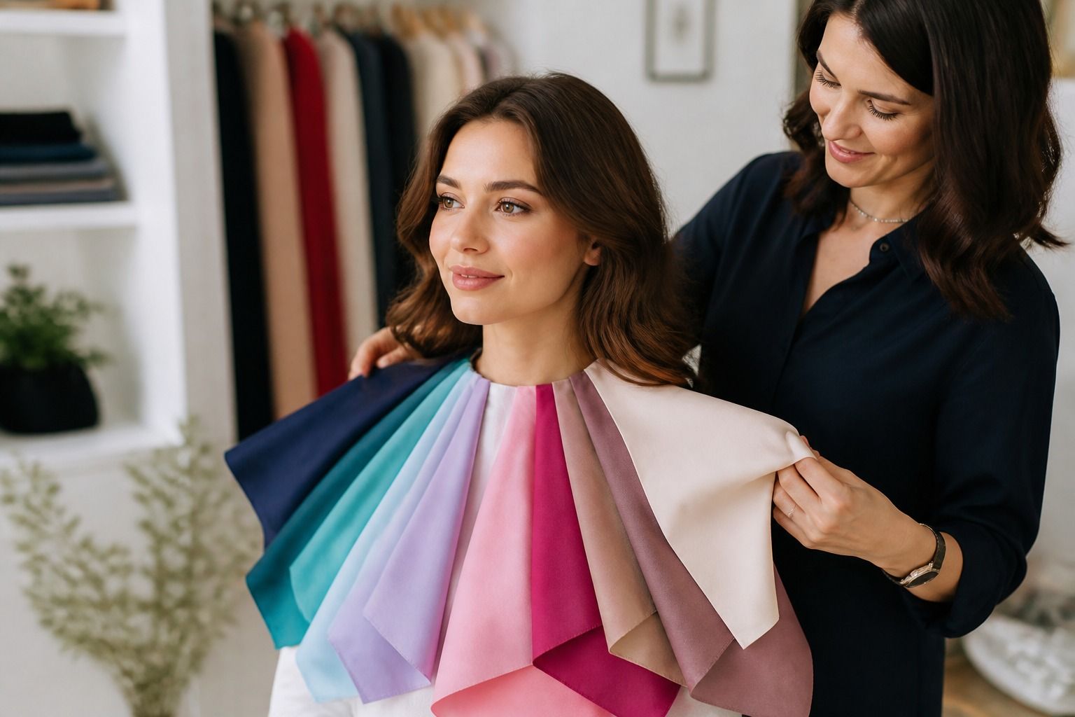
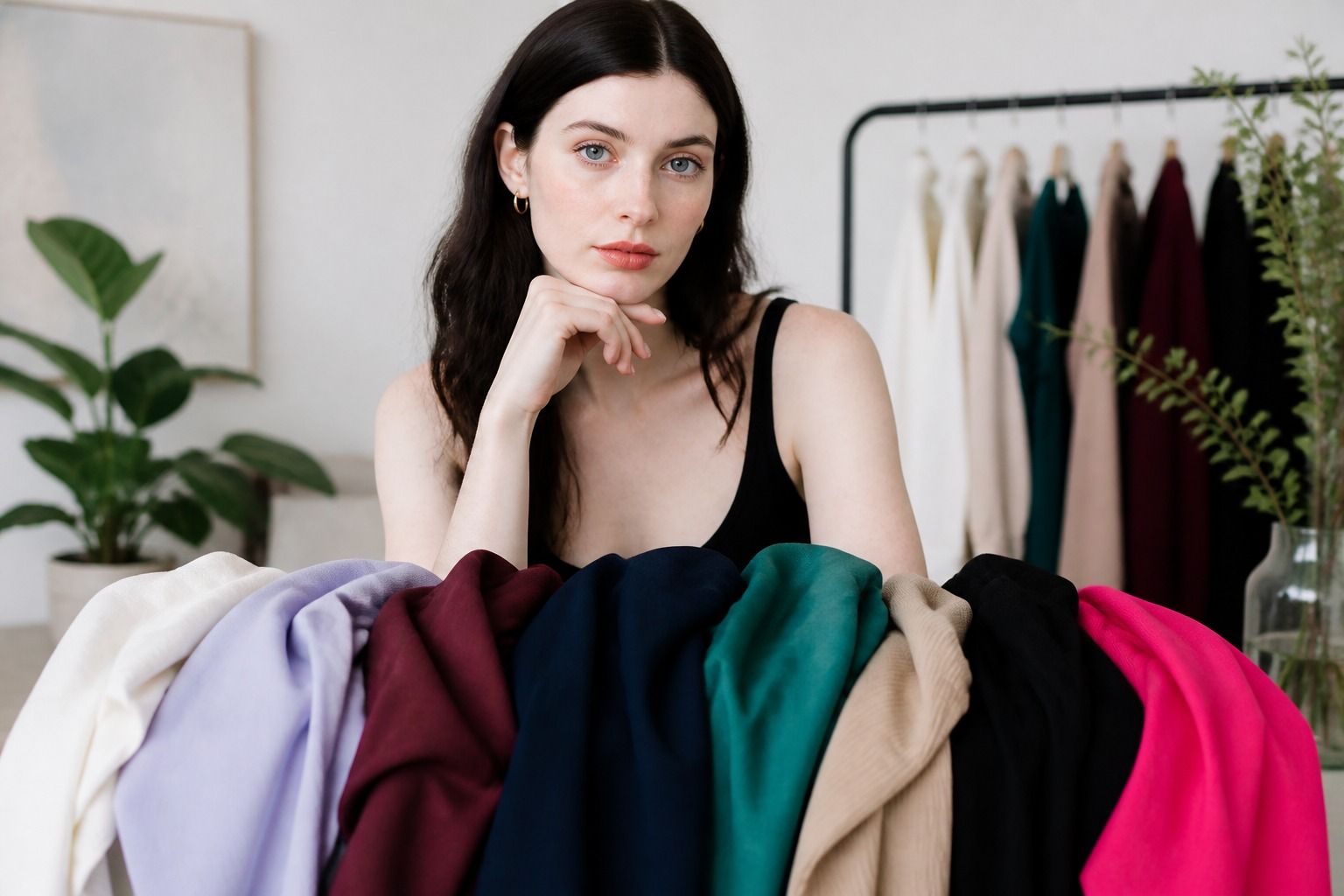
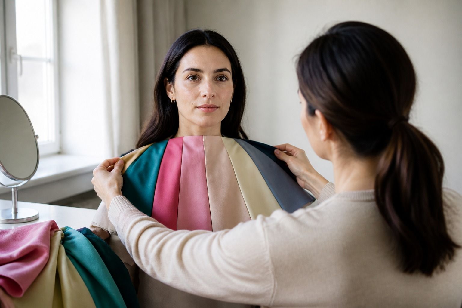
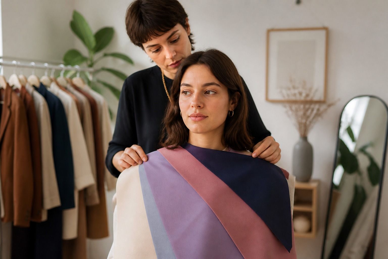
Draping means placing different colored fabrics or garments near the face and observing the effect. You do not need a perfect studio to learn from it. Stand near a large window during indirect daylight, turn off strongly colored lamps, and use a plain background. Keep makeup light or consistent across comparisons. A white towel over dyed hair can stop a vivid hair color from influencing the test.
Start with pairs that differ in one obvious way: cream and optic white, navy and black, dusty rose and orange-red, muted teal and bright turquoise. Hold the fabric high enough to frame the jaw and look at the face, not at the fabric itself. The better color often makes the eyes easier to notice, reduces the sense that the cloth is speaking first, and creates a cleaner transition around the jaw. Those effects can be subtle.
Take breaks. After looking at ten colors, almost anything can start to look informative. Photographing the setup can help, but a phone may change exposure and white balance between shots. Use photos to remember a comparison, not as unquestionable evidence. If two colors produce different results in the mirror and on camera, repeat the test in the same light before drawing a conclusion.
A practical check is to wear the strongest two or three colors for a normal day. See them at a desk, outside, and under shop lighting. A color that looks excellent in a still selfie may feel too demanding after eight hours. Personal color analysis should survive ordinary life, including a rushed morning and a jacket thrown over the top.
Turn a palette into clothes you will actually wear
Begin with the colors that will do the most work. Choose two or three neutrals for trousers, coats, shoes, and bags, then add a few face-adjacent colors for shirts, knitwear, scarves, and dresses. If black makes you look tired but you love black trousers, keep it below the waist and try charcoal, ink navy, or dark chocolate near the face. The same observation can make shopping faster without turning your wardrobe into a laboratory.
Use a palette as a set of relationships rather than a cage. A favorite bright yellow may sit outside your strongest range and still be worth keeping as a bag or a summer skirt. A supposedly perfect mauve may never leave the hanger because you dislike the mood it creates. Comfort, context, fabric texture, and the rest of the outfit all affect whether a color feels right. No chart can decide that part for you.
When a shade is close but slightly difficult, change its distance from the face. Put it under a jacket, break it with a neckline, or repeat a small detail of the same color in earrings or shoes. Sometimes the issue is scale: a full emerald coat is a bigger commitment than an emerald belt. Sometimes the issue is contrast: the color works when paired with a softer neutral and looks abrupt beside stark white.
The most useful final result is a short list of observations you can remember: I suit softened colors better than electric ones; medium-depth neutrals are easier than very pale beige; blue-reds work near my face; warm camel needs a cooler shirt underneath. That kind of language travels well from a mirror to a changing room. The season label can stay in the background, while the actual clothing decisions become clearer.