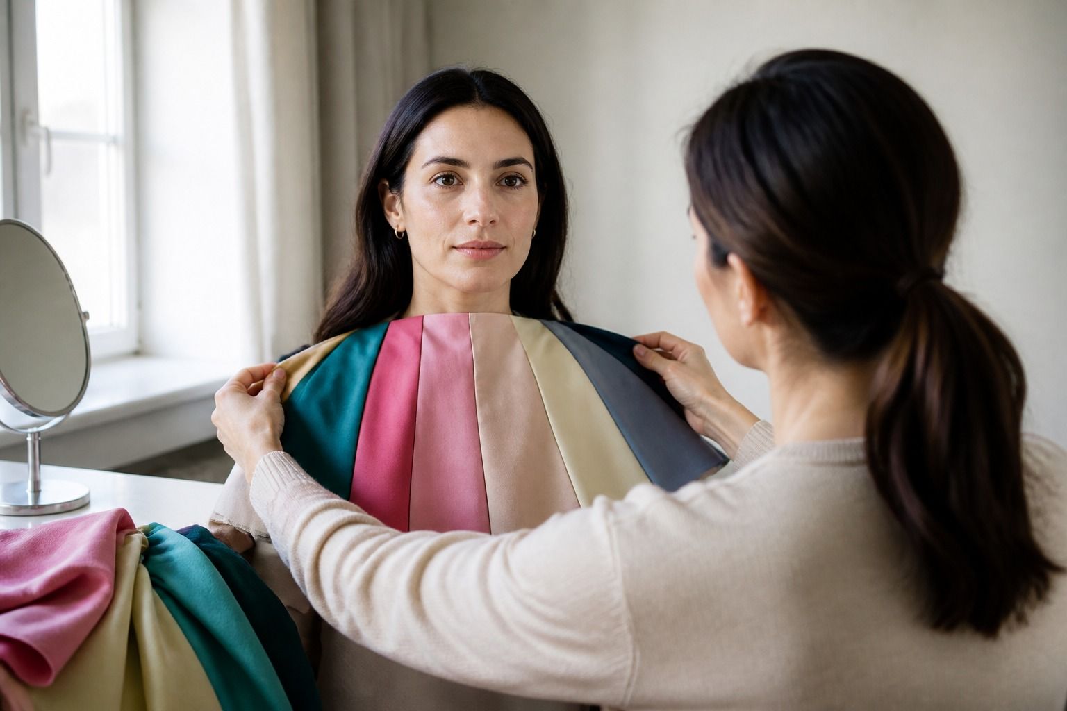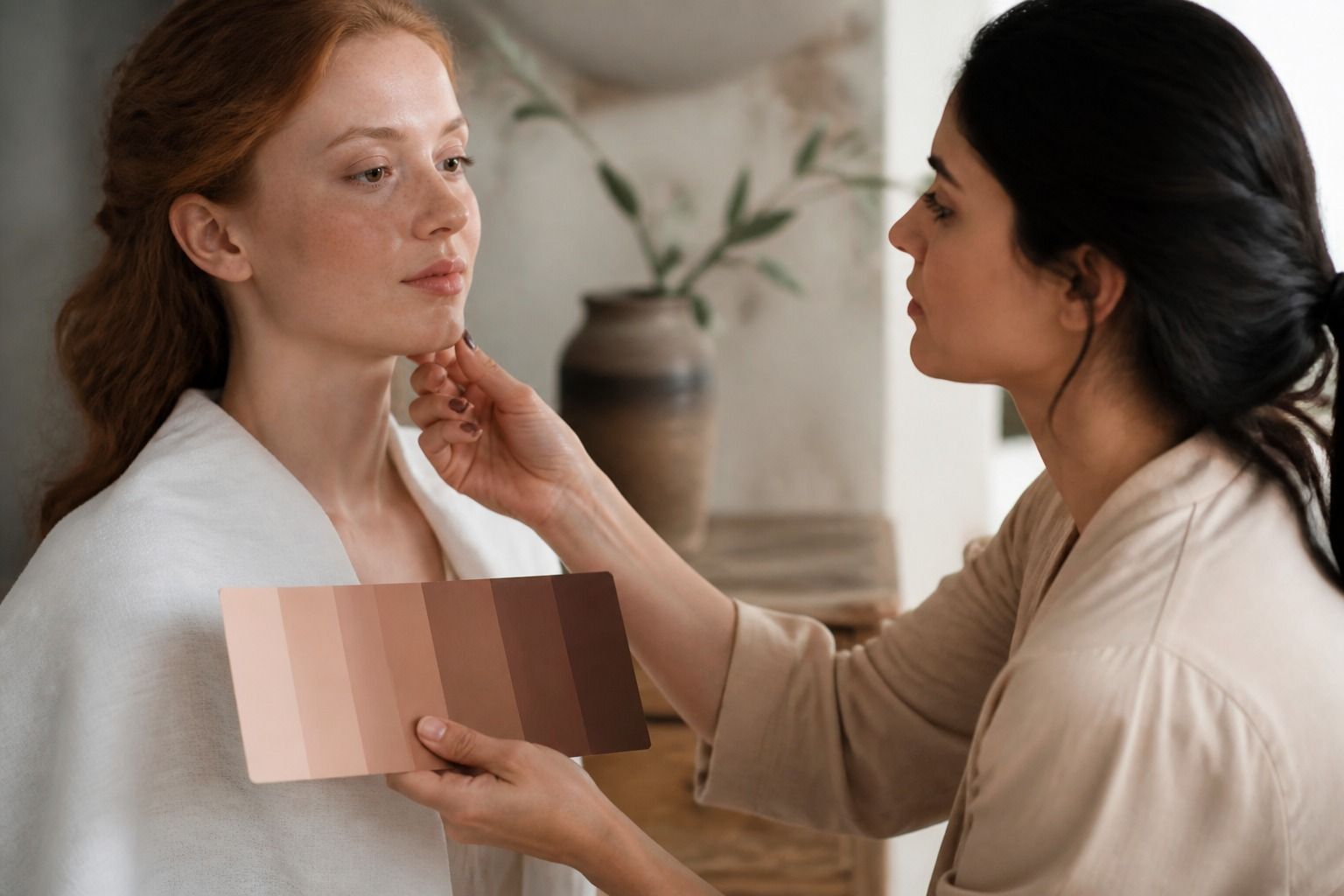
A skin tone chart can be useful when you need a shared starting point for describing complexion, but its names are approximate. Skin tone changes with light, season, body area, and camera settings. More importantly, skin depth and undertone describe different things. Fair, medium, and deep refer broadly to depth or value, while warm, cool, neutral, and olive describe a color direction. A careful chart helps you compare those dimensions without turning a description into a ranking or pretending it can identify a complete seasonal palette.
Why skin tone names are approximate
Words such as fair, light, medium, tan, brown, and deep are convenient, but they do not have universal boundaries. One brand may call a shade light beige while another calls a very similar shade fair neutral. A photographer may describe the same complexion as golden brown in warm afternoon light and neutral brown beside a blue-grey background. The difference does not mean the skin has changed into a new category. The viewing conditions and the vocabulary have changed.
Names also carry different meanings in different places. A word that feels ordinary to one person may feel too broad, outdated, or uncomfortable to someone else. This is why a respectful description should be treated as a practical label for a specific task, not as a permanent identity. If you are choosing a shirt, saying medium depth with a muted olive cast may be more useful than insisting on one name from a chart.
Charts are also affected by their own design. Printed samples vary by paper and ink, screens vary by brightness and color profile, and a row of swatches can make neighboring shades appear more different than they do in real life. Use a chart to narrow a comparison, then look at real fabric or your face in stable daylight. The chart is a reference, not a measuring instrument.
Separate depth from undertone
Depth, sometimes called value, describes how light or deep the visible skin color appears in a particular area. Undertone describes the subtle color direction beneath that surface impression. A person with fair skin can have a warm, cool, neutral, or olive undertone. The same range of undertones appears across medium and deep skin. These are separate observations, so a chart that combines them into one name can hide useful information.
| Broad description | What it usually describes | What it does not tell you |
|---|---|---|
| Fair or very light | A lighter visible depth, often with a wide range of pink, peach, beige, or olive casts | Whether the undertone is cool, warm, neutral, or olive |
| Light to medium | A depth between very light and medium, which may shift noticeably with sun or indoor light | Which seasonal palette will work best |
| Medium or tan | A middle depth that may look golden, neutral, red-brown, muted, or olive | Whether a color will be clear, soft, warm, or cool near the face |
| Brown or deep | A deeper visible value with many possible temperature and saturation patterns | Whether black, white, jewel tones, or earth tones will automatically suit it |
| Olive | A muted green, grey, yellow, or mixed cast that can appear at several depths | A depth category on its own |
The table works best if you read the first column as a rough description and the second as a reminder to keep looking. Olive, for example, is often used as an undertone description rather than a depth label. A medium olive complexion and a deep olive complexion may need different clothing contrast even if they share a similar muted cast. A fair neutral complexion may handle a different version of white or beige than a deep neutral complexion.
Seasonal color analysis adds more dimensions. It considers temperature, depth, chroma, and the contrast between your features. Skin tone alone cannot identify Spring, Summer, Autumn, or Winter. Eye color, natural hair color, and the way different fabrics affect the face can all change the useful conclusion. Treat a chart as the first description, not the final palette.
How light changes the reading
Natural daylight is useful because it usually reveals color more evenly, but even daylight is not one fixed thing. Morning light can be cooler, late afternoon light can be golden, and direct sun creates highlights that make some areas look lighter. A north-facing window, open shade, and a room with a warm lamp will each produce a different version of the same complexion. If you compare yourself with a chart, keep the light consistent and avoid judging from a single dramatic photograph.
Camera exposure can flatten deeper colors or brighten lighter ones. Automatic white balance may also add yellow to a grey room or blue to a shadow. A mirror gives you a more immediate view, but the surrounding wall, your shirt, and the light source still matter. Hold a plain grey or soft white card near the face as a quiet reference. Do not use a phone filter or a heavily edited selfie for a skin tone chart comparison.
The body area matters as well. The face may have more surface redness, the neck may sit in shadow, and the inner arm may be lighter because it gets less sun. If you are describing complexion for clothing colors, use the skin around the face and jaw as the main reference. If you are matching a cosmetic product, that is a different task with different testing needs. A chart should not encourage you to treat every area of the body as the same shade.
Try a second check on another day if the result feels uncertain. A label that appears only under warm indoor light is not strong evidence. When the same general depth and undertone direction remain visible in indirect daylight, a neutral room, and a simple fabric comparison, the description becomes more useful without needing false precision.
Use a chart without forcing a category
Begin by choosing the closest broad depth, then pause before selecting a name that feels more specific. If you are between light and medium, write both down. If your skin looks beige in one area and green-grey beside a warm foundation, note the mixed impression instead of forcing it into warm or cool. A chart is allowed to leave you with a range. In fact, a range is often more honest than a single swatch.
Compare neighboring swatches rather than scanning the whole chart at once. Put the chart beside your face in indirect daylight, keep the screen or paper at a comfortable distance, and look for a broad match rather than an exact pixel color. Check whether the sample makes your face look more yellow, pink, grey, or green by comparison. That shift often tells you more about the chart's undertone than the name printed below it.
Do not use a chart to assign a beauty value, a social category, or a supposed ideal. Depth is not a measure of attractiveness, health, or how well someone can wear color. Names should help people communicate about fabric, photography, product shades, or wardrobe choices. They should not be used to rank complexions or imply that one end of a chart is preferable to another.
When a label is needed for a practical reason, add the context. Medium depth in indirect daylight is clearer than medium on its own. Warm beige with a slightly muted cast says more than beige. Deep neutral with medium contrast gives a clothing adviser more usable information than a single broad category. Context makes the description more accurate and less likely to be mistaken for a fixed identity.
Move from description to useful color choices
Once you have a rough description, test clothes instead of predicting from the name. Hold cream, soft white, black, navy, charcoal, camel, and a mid-tone denim near your face. Then add a few colors from different families, such as rose, coral, teal, forest green, berry, rust, and chocolate. Watch the face as a whole. Does the color bring clarity to the eyes and lips, or does it make surface shadows and uneven redness more noticeable? The answer may depend on depth and contrast as much as undertone.
For fair or light skin, the challenge may be choosing enough depth without letting a dark neutral overpower the face. A soft navy or medium berry can be easier than the hardest black. For medium or tan skin, both clear and muted colors may be possible, but the best version can depend on whether the undertone is golden, neutral, red-brown, or olive. For deep skin, contrast can be adjusted widely. Very pale colors, saturated jewel tones, and rich earth tones can all behave differently depending on the fabric, brightness, and surrounding outfit.
Olive and neutral complexions often benefit from comparisons that are close together. Try teal beside warm turquoise, taupe beside yellow beige, and muted berry beside orange-red. These pairs reveal whether the main issue is temperature, saturation, or depth. If both versions look fine, choose based on the outfit and the effect you want. A chart does not need to predict every answer before you try the garment.
Keep a short list of what you learn: the best near-face neutrals, colors that need a softer fabric, shades that work better below the waist, and combinations that feel balanced. That list will be more personal than a generic skin tone chart with names. It respects the useful information in complexion descriptions while leaving room for light, clothing, contrast, and your own preferences.