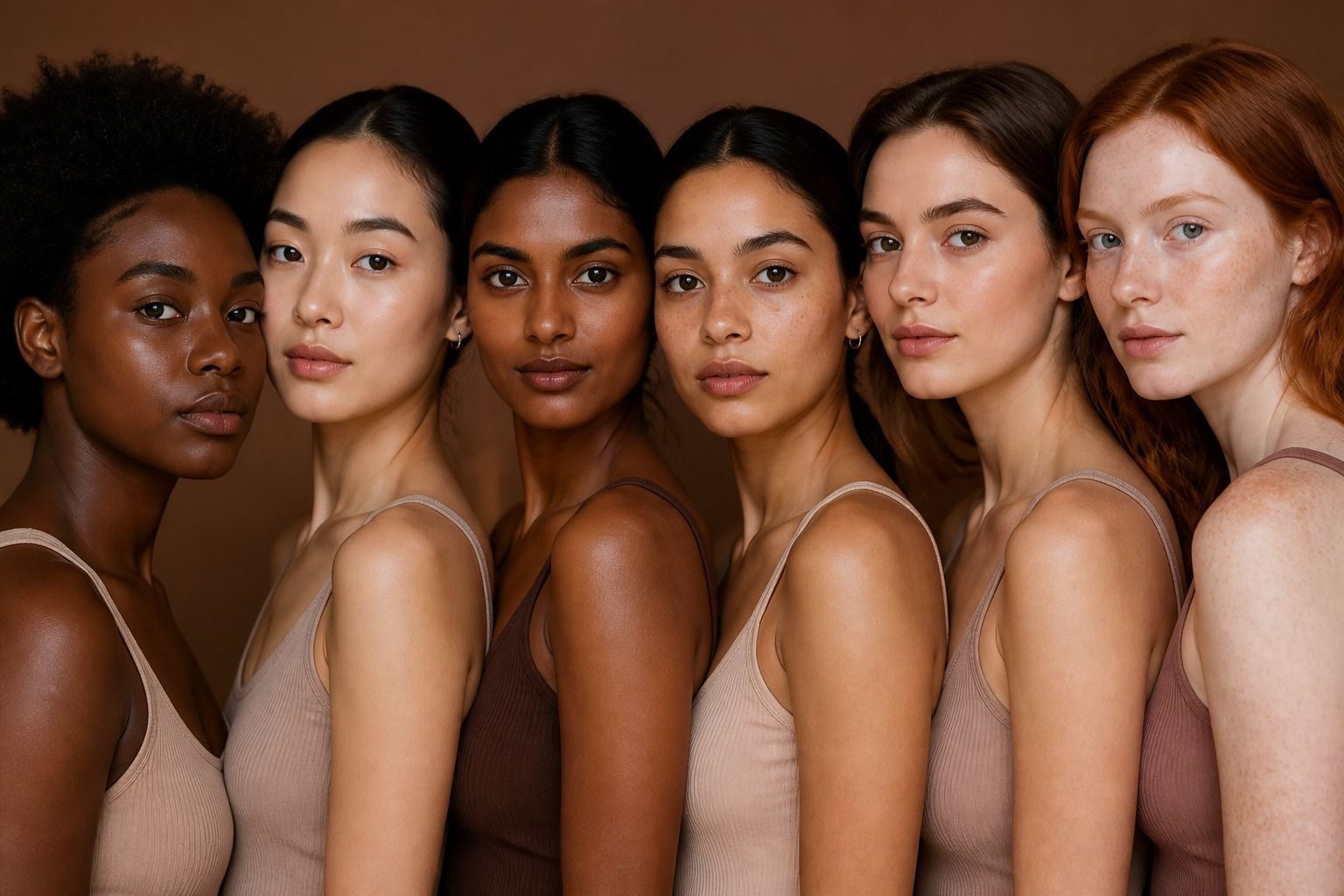
Lists of skin tones can be helpful when you need a starting vocabulary, but they become misleading when they pretend to cover every complexion. Words such as fair, medium, deep, olive, golden, brown, and ebony describe different parts of what we see, and they do not always describe the same part. One name may refer to skin depth, another to undertone, and a third to the way a person or community prefers to describe their own complexion. A more useful approach is to separate those ideas, notice how lighting changes the result, and use color names as descriptions rather than rankings.
Why a list can never cover every complexion
Human skin has continuous variation, while language likes tidy boxes. A list of skin tones may place fair, light, medium, tan, deep, and very deep in a neat order, but two people with the same apparent depth can have different undertones. One medium complexion may lean golden, another rosy, another olive, and another balanced. Hair, eyes, freckles, surface redness, and surrounding colors also affect the way the skin appears.
Even familiar terms are not fixed measurements. Fair skin can be pink, peach, neutral, or olive. Medium skin may be described as beige, tan, honey, caramel, brown, or golden depending on the person, country, brand, and context. Deep skin may include red, neutral, cool, golden, or olive impressions. These words can be useful in conversation, but they are not a universal chart with exact borders.
The problem grows when a color list is treated as a scale of attractiveness. Skin depth is a visual characteristic, not a score. A chart should help someone explain a shade, choose a foundation family, understand a clothing color, or communicate an illustration project. It should not suggest that one complexion is more refined, healthy, elegant, or desirable than another. If a description does not help with a real decision, it may be decoration rather than useful information.
Separate depth, temperature, and surface color
Skin depth is the relative lightness or darkness of the visible complexion. Undertone is the subtle temperature beneath the surface, often discussed as cool, warm, neutral, or olive. Surface color is what may be most noticeable on a particular day: a tan, freckles, flushing, a shadow, or an area with more redness. These dimensions can overlap, but they are not interchangeable.
For example, someone may have medium depth, a neutral undertone, and a temporary rosy surface. Someone else may have deep skin with a golden undertone and a muted olive cast. A third person may have light skin that is clearly warm. Calling all three beige, brown, or pale would leave out information that matters when choosing clothing colors or comparing cosmetics. A better description states the dimensions separately when the decision requires it.
| What you are describing | Examples of useful language | What the words do not tell you |
|---|---|---|
| Skin depth | Light, medium, tan, deep | It does not identify undertone or a seasonal palette. |
| Undertone | Cool, warm, neutral, olive | It does not say how light or dark the complexion is. |
| Surface color | Rosy, freckled, sun-kissed, uneven | It may change with lighting, weather, or recent sun exposure. |
| Color impression | Golden, peach, red-brown, muted | It needs context and may not be a stable category. |
These terms are not diagnoses. Skin color can tell you something about a visual comparison, but it cannot be used to infer health, circulation, or a medical condition. If a skin change concerns you, a color chart is the wrong tool for answering that question. For personal color analysis, stay with clothing harmony, lighting, and appearance rather than turning visual language into a health claim.
Use descriptive names without ranking
Color names carry personal and cultural meaning, so the most respectful choice is often to use the wording a person uses for themselves. Some people prefer light or deep. Others use brown, Black, golden, red-brown, olive, or a family term that is meaningful in their community. A product form may need a compact label, while a conversation about wardrobe colors can be more specific. Accuracy includes context and consent, not only the shade on a screen.
Terms such as golden skin or olive skin usually point to a color cast, not a depth category. Ebony may be meaningful as a self-description or an artistic color reference, but it should not be used as a generic label for every deep complexion. Likewise, tan can describe temporary sun exposure for one person and a longstanding depth description for another. No single name is automatically more correct when the person being described has not chosen it.
Avoid building a list that implies a ladder from desirable to undesirable. Words such as porcelain, honey, caramel, mocha, and cocoa can sound friendly in marketing, but they may also turn complexions into food or luxury metaphors. That may be acceptable in a specific product line if customers recognize the naming system, yet it is a poor basis for explaining all skin tones. Plain descriptions are often clearer: medium depth with a warm undertone, or deep complexion with a neutral olive cast.
When writing or designing a chart, include a note that names are approximate. Show several examples within each broad family rather than one swatch that claims to represent everyone. Use varied faces, hands, and lighting conditions if the chart is visual. The goal is recognition and communication. A person should be able to say this is close, but I am more muted or my undertone is different, without being forced into a wrong box.
How lighting changes a label
Light can make the same complexion look significantly different. Warm indoor bulbs add yellow or orange. Cool fluorescent light can make skin look grey or green. Direct sun increases contrast and may exaggerate surface color. Open shade is often easier for comparing clothing because it is bright without the hard shadows of midday sun. A phone camera then adds its own exposure, white balance, and processing decisions.
Background color changes perception too. A white wall can make medium skin look deeper by contrast, while a dark wall may make it look lighter. A bright red shirt can reflect color onto the face. A green sweater may make nearby redness more visible, while a soft grey can make the skin appear more saturated by comparison. This does not mean the skin has changed. The visual relationship has changed.
If you are checking a skin tone chart or comparing color names, use the same light and a neutral background for every sample. Keep the camera at face height and avoid beauty filters. Compare a bare area such as the jaw or inner arm only for a narrow visual purpose, because different parts of the body naturally vary. Do not edit a photo until the skin matches a preferred label. That creates a color reference for the software, not a reliable description of the person.
Lighting is one reason exact digital swatches are risky. A hex code may look different on another screen, and fabric may reflect light differently from a flat color block. Seasonal color analysis also relies on relationships between colors, not on assigning one permanent pixel value to the skin. Treat a chart as a conversation starter. Confirm important choices with the real garment, preferably near the face and in the light where you will wear it.
Connect complexion description to clothing choices
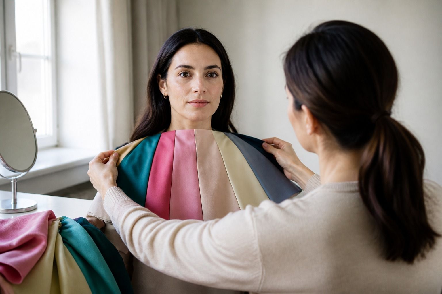
Once the description is separated into depth, undertone, and surface color, it becomes more useful for clothing. Start with the color next to your face, because a blouse, scarf, jacket, or collar has more visual impact than a shoe. Compare two shades with similar depth, such as cool rose and warm rose, or navy and chocolate. This makes it easier to see whether temperature is helping or whether one option is simply darker.
Light complexions may need attention to contrast, but they do not all need pale clothing. Medium and deep complexions may work with both bright and muted colors, depending on their contrast and undertone. Olive skin can respond differently to yellow beige, blue-green, rust, and plum. Golden skin may prefer warmth, yet a cool berry can still work if the value and intensity are right. The useful question is not which colors belong to a category. It is what does this shade do beside this face?
Try a practical wardrobe test with four pieces: a light neutral, a medium neutral, a warm accent, and a cool accent. Stand near a window and look at the whole face. Does the color make your features easier to see? Does it emphasize an area you would rather not emphasize? Does the outfit look balanced before you add makeup or jewelry? Keep notes in ordinary language. Even, clear, soft, heavy, grey, yellow, and too bright are more actionable than flattering, which can mean almost anything.
Use a color that almost works in a lower-commitment position. A strong orange can be a bag or skirt rather than a blouse. A pale beige that erases the face may work with a dark neckline or a patterned layer. A cool lavender that feels too cold near the chin can still be useful in a print. This is where a personal palette becomes practical: it helps you decide placement, contrast, and scale instead of issuing a ban.
Names for skin tones should make clothing decisions clearer, never smaller. The best description is the one that gives enough information for the task and leaves room for the person to describe themselves. Use broad terms carefully, separate depth from undertone, check the light, and let real fabric settle the question. A chart can point you toward a useful comparison, but your face in your everyday clothes is the final reference that matters.