A phone camera can help you look for undertone clues, but it cannot see your skin in the same way that you do in person. Exposure, white balance, a bright window, and the color of your shirt can all change the result. A useful skin undertone test with a camera is therefore a repeatable comparison, not a one-photo verdict. Take several carefully controlled images, compare them with other clues, and then test the likely result against clothing colors in ordinary daylight.
Why the camera is a clue rather than a verdict
Phone cameras are designed to make a scene look pleasing and readable. They may brighten a face, reduce shadows, warm a grey room, or adjust the image when a white wall fills the frame. A front-facing camera can also soften detail and alter the balance between pink, yellow, and green. Two photos taken thirty seconds apart may look as if they show different skin, even when your face has not changed.
Surface color makes the problem harder. A recent flush, a blemish, a sun-exposed forehead, or a cool blue shirt can affect what the camera records. Undertone refers to the subtle temperature or cast beneath the changing surface impression. It is not the same as how light or deep your skin appears, and it is not a statement about your health. The camera may help you notice a repeated pattern, but it cannot separate every variable by itself.
Think in terms of confidence rather than certainty. If three photos in neutral daylight make warm gold look more connected to your face than bright silver, that is a useful clue. If one photo makes you look strongly pink and another makes you look olive, the correct conclusion may simply be that the setup is unstable. Start again before naming an undertone.
Prepare a repeatable photo
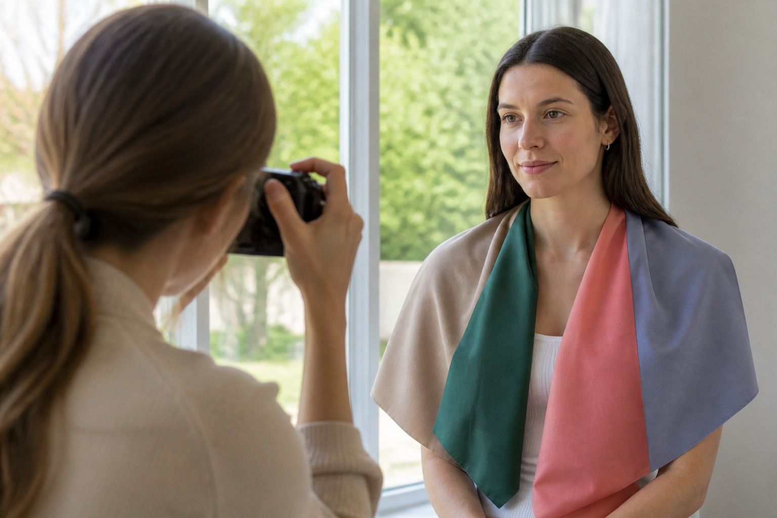
Choose a place with steady, indirect daylight, such as a room beside a north-facing window or a shaded outdoor area. Direct sun creates hard highlights and deep shadows. Turn off warm lamps and avoid colored walls if you can. Wear a plain grey, cream, or muted top, and keep bright scarves, printed collars, and strong makeup away from the face. If your hair is dyed a vivid color, cover it with a neutral towel or pull it back so it does not become part of the comparison.
Clean the camera lens, hold the phone at eye level, and keep your face in the same position for each image. Do not use portrait blur, beauty filters, or a color effect. Lock focus and exposure if your phone allows it, especially if the background is much lighter than your face. Take one photo facing the window and another at a slight angle. The second view can reveal whether a shadow is being mistaken for a color cast, but it should not replace the first.
Include a plain white card or a neutral grey card at the edge of one frame, without letting it cover your face. It gives you a rough reference for how the camera is treating the light. The card is not a perfect calibration tool, and household paper may be blue or cream, but it is better than judging a face against a colorful room. Keep the same device and room if you repeat the test later.
| Photo variable | What it can distort | Better choice |
|---|---|---|
| Direct sun | Creates bright highlights and sharp shadows that exaggerate surface variation | Open shade or indirect window light |
| Warm lamp | Makes cool colors look less cool and skin look more golden | Turn the lamp off and use daylight |
| Auto exposure | Changes when the background is very light or very dark | Lock exposure and keep the framing steady |
| Colored clothing | Reflects color onto the jaw and lower face | Wear grey, soft white, or another quiet neutral |
| Beauty filter | Removes texture and may shift hue or brightness | Use the unedited camera image |
Compare several undertone signals
Once you have a stable photo, look at more than one signal. The vein test is a starting point, not a rulebook. Blue or purple-looking veins may suggest a cool direction, while green-looking veins may suggest warm or olive coloring. Many people see a mixture, and veins can look different on the wrist, forearm, and inner elbow. Camera color correction can shift blue toward purple or green toward grey, so do not label yourself from a single close-up.
Try a gold and silver comparison in the same light. Hold a plain piece of each metal near the face, or photograph the comparison with the metal touching a neutral top. Ask which one makes the skin look more even and which one creates a distracting yellow, grey, or pink reflection. Jewelry finish matters. Brushed silver is quieter than a mirror-polished piece, and yellow gold can be a different test from pale champagne gold.
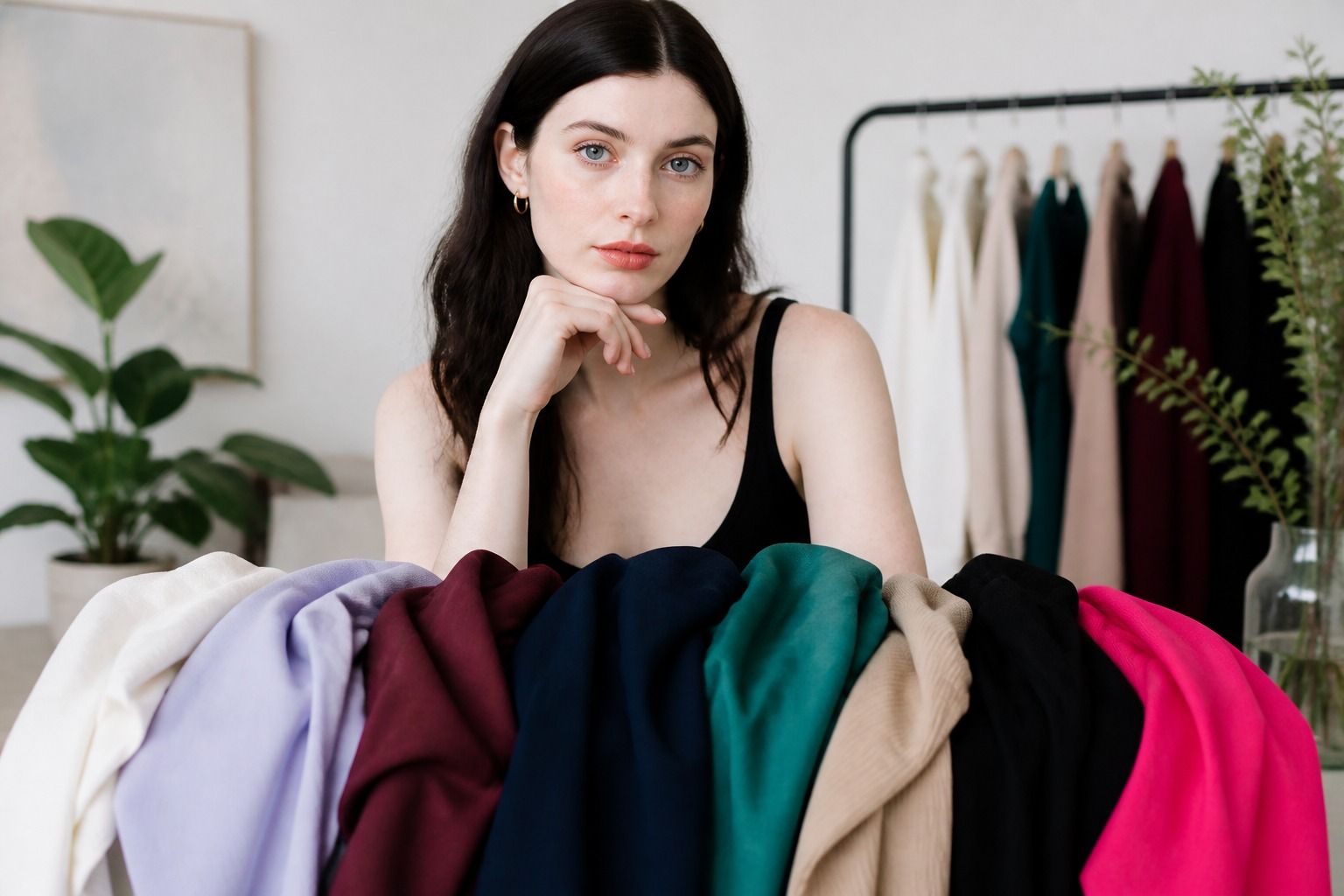
Then compare fabric colors. Cool undertones often find that blue-based rose, berry, blue-red, or smoky blue sits comfortably near the face. Warm undertones may find peach, tomato, camel, moss, or warm coral more connected. A neutral undertone can move between both groups, but usually still has preferences for depth, softness, or brightness. Olive undertones are often muted and can look green-grey beside some colors, which is one reason a warm-versus-cool choice may feel incomplete.
Do not expect every clue to agree. Gold may look good because your coloring has enough depth, not because you are strongly warm. Silver may work with a neutral or cool olive undertone, but the wrong silver can look flat on anyone. The useful question is whether a color makes your face look more balanced across several tests. A result that appears only under one camera setting is weak evidence.
Separate surface redness from undertone
Redness is the most common reason people misread a camera undertone test. The cheeks and nose may appear pink while the neck, jaw, or forehead looks more yellow, beige, or olive. A phone tends to emphasize the brightest part of the face, especially when the exposure is high. If you judge only the cheeks, you may decide that you have a cool undertone when the broader pattern is neutral or warm.
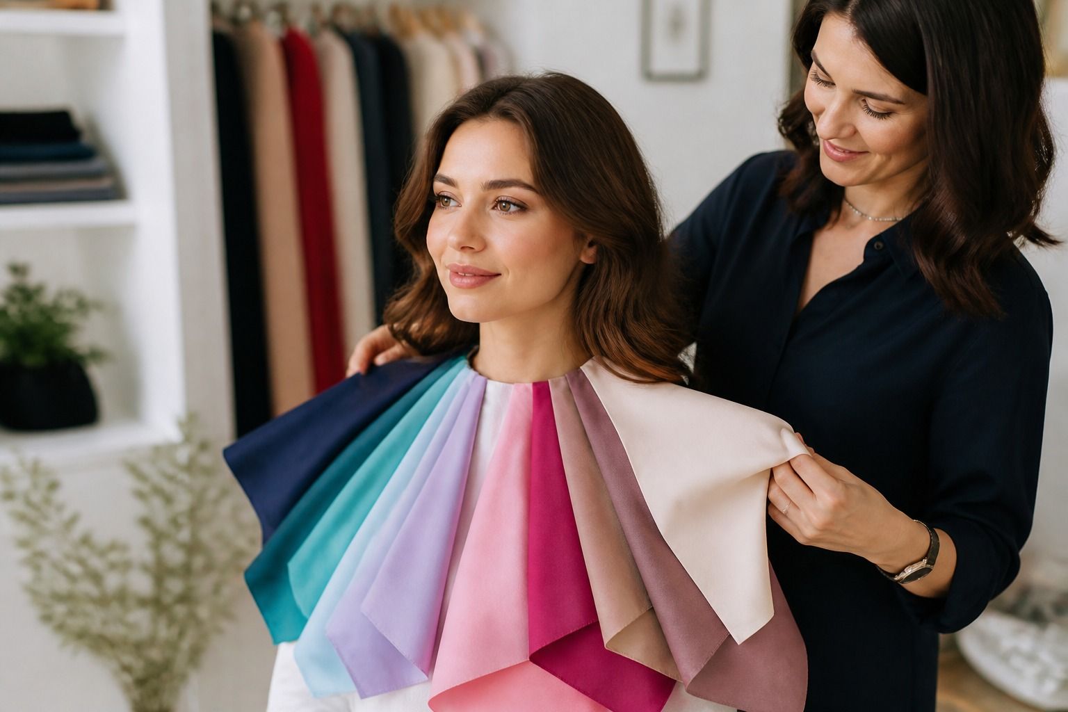
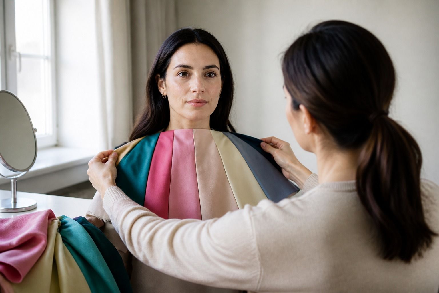
Look at the area from the jaw to the neck, while remembering that the neck may be more shaded than the face. Compare the forehead and lower face rather than zooming into one patch. A neutral background helps. You can also place a piece of soft blue, warm peach, and muted olive fabric beside your face. If the same colors settle the appearance of the whole face, that result is more helpful than a close-up of one red area.
Skin can also look different after exercise, a hot shower, cold weather, or a long day outdoors. Wait until your face has returned to its ordinary state before photographing it. Makeup and tinted sunscreen should be removed for the undertone test, but do not scrub or irritate the skin to create a supposedly clean starting point. The test needs normal conditions, not an artificial blank surface.
If a camera consistently makes one feature look stronger than it does in person, trust the repeated in-person comparison more. The point is to choose clothing colors, not to produce a perfect digital sample. A garment that makes your face look calm in a mirror and in daylight has passed a more relevant test than an image that assigns a precise label.
Confirm the result with clothing colors
Use your likely undertone as a short list of colors to compare, then let the clothing decide. Prepare pairs that differ mainly in temperature: peach against blue-based pink, warm red against blue-red, yellow beige against taupe, and olive green against teal. Hold each pair under the chin for a few seconds, step back, and look at the whole face. Take photos only if the light and camera position stay the same.
Notice what happens to the eyes, lips, and shadows. A useful color may make your eyes look clearer, give the lips a little definition, or reduce the sense that the fabric is sitting on top of the face. An unsuitable shade may make the under-eye area look heavier or bring attention to uneven surface color. These effects are subtle. If you need to lean close to the mirror to find a difference, both colors may be workable.
Finally, test the likely palette in an outfit rather than one isolated swatch. A warm coral top may look too strong alone but work with a quiet navy jacket. A cool berry sweater may feel excellent near the face but clash with a warm camel coat. Personal color analysis includes undertone, but also contrast, depth, saturation, fabric, and the colors surrounding the garment. A camera can start the investigation. Your actual wardrobe should finish it.