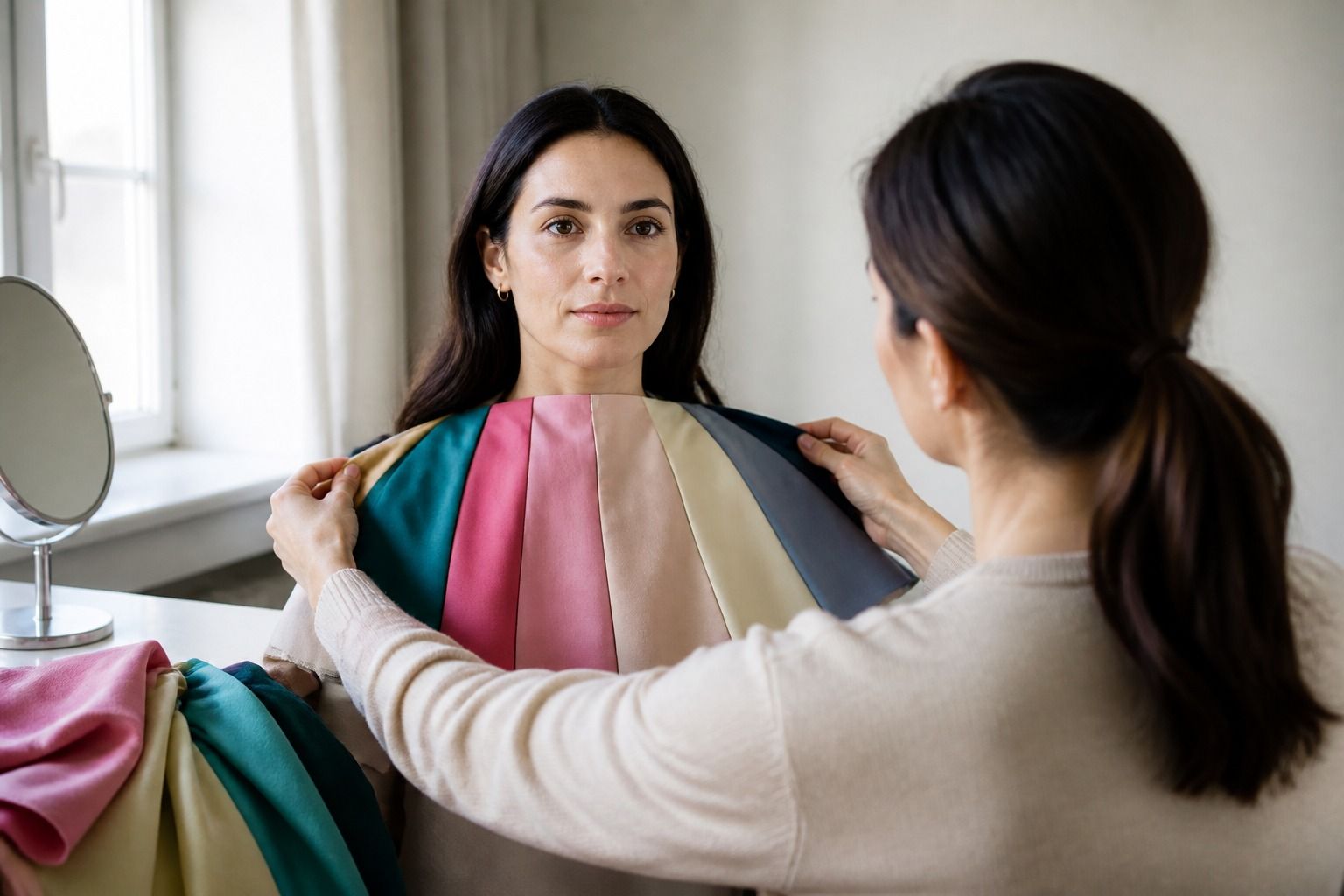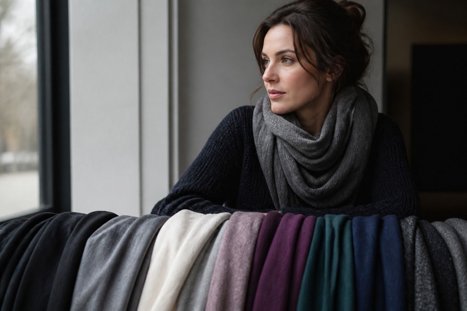
Soft Winter is often described as the quieter end of the Winter family. That description is useful as long as it does not become a new set of hard rules. The practical question is simpler: which cool, moderately deep colors give your face enough definition without making the clothes speak first? A Soft Winter color palette usually answers with charcoal, ink navy, cool burgundy, blue red, and softened jewel tones. The best version is the one you can wear on an ordinary Tuesday, not the one that looks impressive as a digital swatch.
What Soft Winter means in real clothes
Classic Winter palettes are usually associated with cool temperature, strong contrast, and clear color. Soft Winter keeps the cool direction and some depth, then lowers the sharpness. Colors may look smoky, shaded, or slightly greyed rather than bright and glassy. Think of a blue red with a little black mixed into it, a deep teal that has lost its neon edge, or burgundy that looks like velvet instead of a jewel under a spotlight.
This distinction matters because the wrong kind of Winter color can take over the face. A very clear cobalt blouse may appear first, while the person wearing it becomes harder to read. A softer ink navy can keep the same general depth and coolness with less visual noise. That does not mean every Soft Winter needs muted clothes, or that a bright color is forbidden. It means the balance between temperature, depth, and intensity deserves more attention than the label alone.
Seasonal systems also use the name Soft Winter differently. One analyst may place the season close to Deep Winter, while another may use it for people who sit near the Winter and Summer border. Treat the category as a working direction, not a verdict about your appearance. If charcoal works better than jet black and dusty plum works better than electric purple, those observations are more useful than arguing over the exact season name.
Build the foundation with dark neutrals
A dark neutral gives the palette somewhere to start. Charcoal is often easier than pure black because it keeps depth without creating a hard edge around the face. Ink navy is another reliable candidate, especially for coats, trousers, knitwear, and office layers. Soft black can work when the fabric has texture, a matte finish, or a little distance from the face. Cool taupe adds a lighter option, but look for a greyed taupe rather than a beige that turns yellow.
Try making a small foundation before buying a full seasonal wardrobe. A charcoal jacket, ink navy trousers, soft black shoes, and a cool taupe knit already create several combinations. Add a blue-red scarf or a burgundy top when you want more color. This approach also reveals whether the issue is really temperature. If both black and navy look heavy but charcoal feels right, you may need less depth or less contrast than the Winter label suggests.
Fabric changes the result. A shiny black satin can look much sharper than a brushed black wool. A smooth navy shirt may read clearer than a chunky navy cardigan. When a neutral feels severe, try changing the finish before discarding the color. When it feels dull, try a cleaner texture or a lighter companion near the face. The color is only one part of what the eye sees.
| Neutral | What it can do | What to check |
|---|---|---|
| Charcoal | Creates depth with a softer edge than black | It should look cool or balanced, not brownish |
| Ink navy | Works as a dark everyday base and office color | Compare it with a very bright navy to see which leaves the face clearer |
| Soft black | Gives structure without the full force of jet black | Matte or textured fabric may be easier than glossy fabric |
| Cool taupe | Lightens a dark wardrobe without turning warm | Hold it beside grey and beige; yellow cast is easy to miss in a shop |
Use color without overwhelming the face
Soft Winter colors can be cool and interesting without being loud. Start with the colors that sit between a neutral and a jewel tone. Dusty cranberry, cool burgundy, muted teal, smoky violet, and shaded berry are good examples. A blue red can be especially useful when a classic red feels too hot or too crisp. The goal is not to make every color grey. It is to keep enough clarity for the outfit to look alive while avoiding a hard block of brightness next to the skin.
Place stronger colors where you can judge them. A burgundy sweater gives you a better test than burgundy trousers because the fabric sits close to your face. If the sweater makes your skin look even and your eyes more distinct, it has useful contrast. If it pulls out shadows around the mouth or makes redness the first thing you notice, try a cooler, lighter, or softer version. A color can be attractive on a hanger and still be inconvenient near the face.
There is room for bright color in a Soft Winter wardrobe. Use a clear blue red in a small area, such as a bag, shoe, lip color, or narrow stripe in a shirt. If you love electric violet or pure emerald, try it under a jacket, in a print, or farther from the face. Personal style often improves when a difficult color is given the right job instead of being declared good or bad.
Prints deserve the same treatment. A high-contrast black-and-white pattern may feel stark even when both colors are individually workable. A charcoal, blue red, and cool white print may be easier because the contrast has a little more shading. Look at the overall impression from a few steps away. You are building an outfit, not grading isolated swatches.
Soft Winter and Soft Summer are close, but not identical
Soft Winter and Soft Summer can share smoky colors, greyed blues, muted berry, and a preference for softened contrast. The difference is usually found in depth and temperature. Soft Winter tends to handle darker neutrals and cooler, denser accents. Soft Summer often feels more at home in lighter grey, muted rose, dusty blue, and gentle plum. The border can be genuinely difficult, especially under indoor lighting.
Make the comparison with pairs rather than a pile of unrelated colors. Hold charcoal beside heather grey, ink navy beside dusty blue, and cool burgundy beside muted rose. Notice whether the darker option gives your face shape or presses down on it. Then reverse the test with lighter neutrals. If both groups work, you may be near the border, or your contrast may matter more than the label.
Hair color, makeup, and tanning can change the apparent balance, but they should not decide the result on their own. A darker dyed hair color may make a deep palette look more plausible in a mirror while the same colors still feel heavy in daylight. Test with a bare or lightly made-up face when possible, and repeat the comparison on more than one day. A single photo is a weak judge of subtle color differences.
Make the palette useful for work and weekends
For work clothes, Soft Winter can be practical without becoming a row of black suits. Try an ink navy jacket with a cool taupe knit, a charcoal suit with a blue-red blouse, or soft black trousers with a muted teal shirt. Add metal in silver, pewter, or a restrained white gold if those finishes echo the cooler side of the wardrobe. A small amount of warm metal can still work when the rest of the outfit has enough balance, so use the mirror rather than a rulebook.
For casual clothes, texture helps muted colors feel intentional. Brushed cotton, denim, ribbed knit, suede, and washed wool naturally soften a color. Charcoal denim with a dusty berry top may be easier to wear than a perfectly matched outfit in one dark tone. Ink navy jeans with a cool burgundy cardigan create the same depth with more variation. If everything looks flat, add a clearer accent or a lighter near-neutral instead of adding more black.
When shopping, place the candidate garment next to your face in indirect daylight. Check the under-eye area, the edges of the mouth, and the overall clarity of the skin rather than waiting for a dramatic glow. Take one step back and look at the whole outfit too. A color that is slightly outside your strongest range may still be a great skirt or shoe. A supposedly perfect color that makes you fuss with your hair and makeup may be less useful in practice.
The Soft Winter color season works best as a set of observations: cool rather than yellowed, moderately deep rather than pale, and softened rather than aggressively bright. Keep charcoal, ink navy, soft black, and cool taupe nearby, then test burgundy, blue red, smoky teal, and dusty jewel tones in the places where they matter. The label can point you toward a wardrobe, but your repeated comparisons decide which colors earn a permanent place in it.