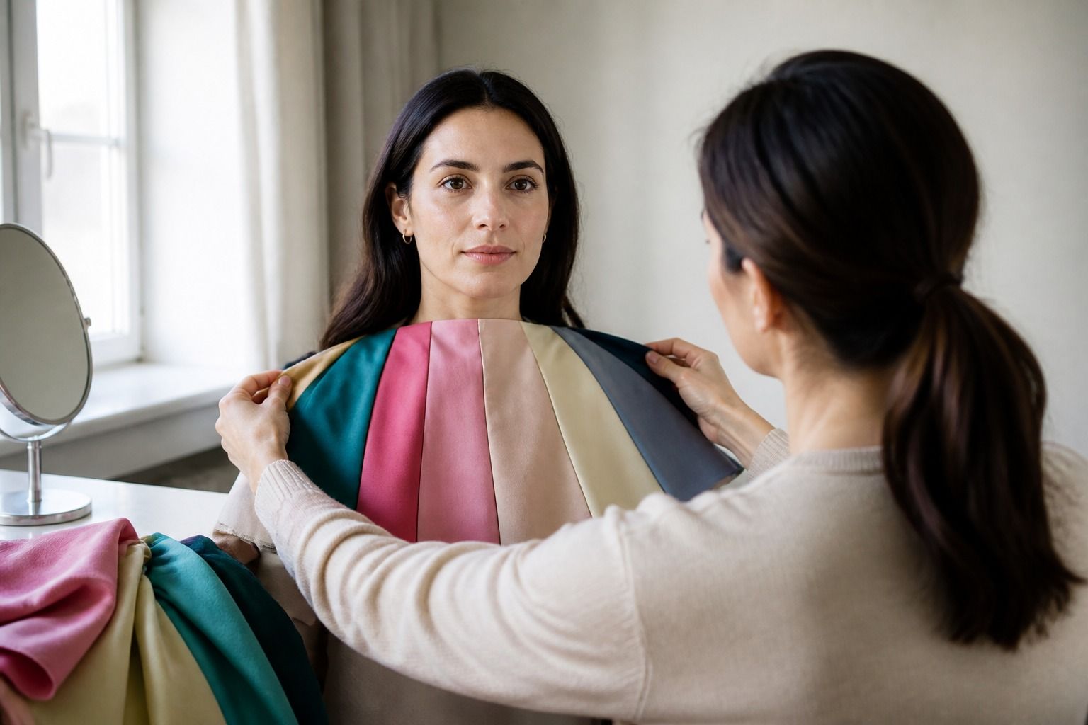
The most useful answer to what colors look good on me rarely comes from a list of universal shades. A color works when it relates well to your skin's undertone, the contrast in your features, and the amount of brightness or softness your face can carry. You can learn a great deal without sorting yourself perfectly into a season. Put several fabrics near your face, compare them in the same light, and watch what changes: your eyes, the shadows under them, the evenness of your complexion, and the way the color itself seems to arrive before you do.
Judge the color next to your face
Start with the part of a garment people actually see first. A shirt, scarf, jacket lapel, or necklace can change the light around your face, while trousers and shoes have a much smaller effect. Stand near a window with indirect daylight. Face the window, keep your hair away from your face if it is dyed a strong color, and remove heavy makeup if you can. The goal is not to inspect whether your skin is perfect. It is to see whether the fabric makes your face look clearer or makes the fabric look like the main event.
Compare one shade at a time with a near alternative. A blue-based pink and a peachy pink are more informative than a random pink and a random green. Hold the fabric below your chin, not against your wrist, because the skin on your hand may be a different depth and may carry more surface redness. Look for practical signs: does the under-eye area look heavier, do small red areas become more noticeable, do your lips seem to lose definition, or does the whole face look calmer? These are observations, not beauty scores.
Use a white sheet or a plain grey top as a temporary background if the room is busy. A patterned blouse can compete with the test, and warm indoor bulbs can push almost every color toward yellow. If a shade looks excellent in a shop mirror but dull at home, repeat the comparison in daylight before buying. Fabric finish matters too. A matte wool, a shiny satin, and a heathered knit can make the same nominal color behave differently.
Use contrast before chasing a season
Contrast describes the difference between the light and dark parts of your natural coloring. It is often easier to see than undertone. Consider the relationship between your hair, eyes, and skin rather than judging each feature by itself. Very dark hair with light skin may handle a stronger difference between a top and a jacket. Light hair and light eyes may look more settled in a lower-contrast outfit, such as dusty blue with soft white, even if a vivid color is technically compatible with the undertone.
Try a simple black-and-white comparison, then soften both ends. Black next to the face can look crisp, or it can make every shadow look deeper. Bright white may look clean, or it may make the face seem grey by comparison. Navy and cream are useful middle tests because they keep some depth without creating the same hard edge. Charcoal, cocoa, and soft denim can also show whether you need contrast that is strong, medium, or quiet.
Contrast is not a rule that tells you to avoid a favorite color. It tells you where to place it. If a high-contrast combination feels too forceful, use the strong shade in a handbag, skirt, or shoe and keep the top closer to your best level of contrast. Conversely, if pale combinations make you disappear, add a dark belt, a defined collar, or a jacket in a deeper neutral. This is how personal color analysis becomes useful in a wardrobe: it gives you ways to adjust an outfit rather than a list of forbidden clothes.
Compare neutrals first
Neutrals deserve attention because they take up most of a practical wardrobe. Test them in the same fabric weight if possible. A thin black T-shirt and a heavy cream sweater do not create a fair comparison, since texture and shape change the visual effect. Place each color near your face for a minute, step back, and take a quick photo from the same position. The photo is only a record of the comparison. Your eyes should make the decision.
| Neutral to test | What to watch | A useful next comparison |
|---|---|---|
| Black | Whether the face looks defined or whether shadows become the first thing you notice | Charcoal or soft black |
| White | Whether the skin looks fresh or noticeably dull beside the fabric | Soft white, oyster, or light stone |
| Navy | Whether the deeper blue gives shape without making the outfit feel severe | Smoky navy or blue-grey |
| Beige and camel | Whether the face stays lively or the shade merges with it in a flat way | Taupe, cocoa, or a clearer camel |
| Grey | Whether the neutral looks balanced or brings out a green, pink, or ashy cast | Blue-grey, warm grey, or mushroom |
One neutral will not settle the entire question. Some people can wear both navy and camel but need the right depth in each. Others find that a particular grey works only when it has enough blue or brown in it. Treat the table as a set of experiments. The most helpful result may be a sentence such as, navy near the face is reliable, while pale beige needs a darker layer. That sentence is more useful when shopping than a label on its own.
Choose accents for different levels of commitment
Once you know which neutrals make you look rested and which contrasts feel natural, test accent colors. You do not need to start with the most saturated version. Compare a clear emerald with a softened forest green, a bright cobalt with smoky denim, or tomato red with muted brick. If one family repeatedly makes the face look more even, you have found a useful direction. The exact name may vary between fabric stores, and the name matters less than what you can see.
Place strong colors according to how much attention you want them to have. A clear jewel tone can work as a top when its contrast and temperature agree with your features. The same color may be easier as a handbag, shoe, nail color, or skirt when it feels too loud beside the face. Earth tones offer a different route. Olive, rust, cinnamon, moss, and chocolate can be excellent, but some versions are yellow and clear while others are cool and muted. Test them rather than treating earth tones as automatically warm or universally easy.
Color repetition can make an outfit feel deliberate without matching everything. Repeat a top's blue in a small print, echo a berry shade in a bag, or use a scarf that contains both your neutral and accent. This matters when your coloring sits between familiar categories. A mixed palette can look coherent when the colors share a level of softness or depth, even if one is warm and another is cool. The face usually needs the closest match; the rest of the outfit has more room to play.
Turn observations into shopping rules
Keep a short record after each comparison. Write down the shade, the lighting, the fabric, and what you noticed. Avoid notes such as good or bad, which are too vague to guide the next purchase. Try phrases like medium-depth blues make my eyes clearer, yellow beige exaggerates redness, or soft white works better than optic white. After five or six comparisons, patterns will appear. You may be surprised by how often the same issue is caused by intensity rather than temperature.
Use those patterns in real shops. Take a photo of a reliable top or carry a small fabric swatch. Compare new clothes with it under the store's lights, then check the finalists near a window or outside. Pay attention to the garment's surface. Brushed cotton diffuses color, while a smooth knit can make it look sharper. A color that works in a matte top may be too bright in a glossy blouse, and a print may be easier to wear because its background breaks up the effect.
Give yourself permission to keep colors that are not perfect near the face. Personal palettes are tools for choosing, not tests you pass. Makeup, hair color, tan, glasses, and the surrounding colors can all change the impression of a garment. If you love black but find it heavy, wear a softer neckline, add a lighter scarf, or use black below the waist. If a pale color feels weak, put it under a jacket with more depth. The best answer to what colors suit me is usually a small set of repeatable observations, not a rigid identity.