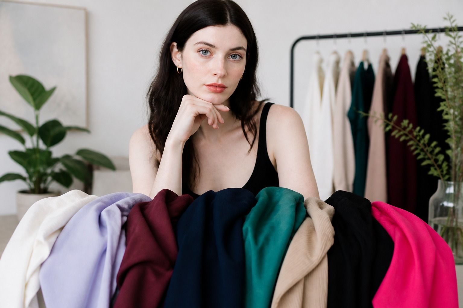
When people ask what season they are, they usually want a short answer they can use while getting dressed. The trouble starts when a quiz gives one label, a mirror seems to disagree, and the black or beige in the wardrobe refuses to behave. Seasonal color analysis is more useful when you treat it as a comparison of color relationships. Temperature matters, but so do depth, softness, clarity, and the amount of contrast your face can carry. You do not need to force yourself into a perfect box. You need a repeatable way to notice which colors support your face and which ones make you adjust the rest of the outfit.
What the four seasons actually describe
Spring, Summer, Autumn, and Winter are names for four broad color families. They are not personality types, and they do not describe how cheerful, serious, dramatic, or relaxed a person is. Spring colors tend to feel warm and clear. Summer colors usually lean cool and softened. Autumn colors are warm and subdued, often with more depth. Winter colors are cool and clearer, with stronger contrast. These are starting points, not verdicts about your appearance.
A useful analysis looks at several dimensions at once. Temperature asks whether a color has a warm yellow or golden cast, a cool blue or pink cast, or sits near the middle. Value is the lightness or depth of the color. Chroma describes how muted or vivid it feels. Contrast is the difference between the lightest and darkest features in your face and the amount of separation that clothing can handle near it. A person can have a cool undertone and still look better in soft, smoky colors than in crisp jewel tones.
That is why undertone alone rarely answers the question. A cool rose and a cool fuchsia share a cool direction, but they do not have the same intensity. A warm camel and a warm coral also behave differently because one is quiet and earthy while the other is much brighter. Put either pair beside the face and you can see why the season needs more than a warm-versus-cool label.
Use the seasons as a language for choosing fabric and clothing. If a pale blue shirt makes the skin look calm but a saturated cobalt shirt takes over the face, the issue may be chroma or contrast rather than temperature. If warm ivory is easier than stark white, value and softness may be doing more work than the undertone. These small observations are often more reliable than trying to recognize yourself in a single color chart.
| Season family | Common impression | Useful first comparison | Frequent mistake |
|---|---|---|---|
| Spring | Warm, light to medium, often clear | Warm ivory beside cool white | Assuming every warm color will work |
| Summer | Cool, soft, light to medium | Dusty rose beside bright pink | Confusing coolness with high contrast |
| Autumn | Warm, muted, medium to deep | Olive beside icy mint | Choosing orange because it is warm |
| Winter | Cool, clear, medium to deep | Black and white beside softened navy | Thinking dark automatically means Winter |
Find the dominant characteristic first
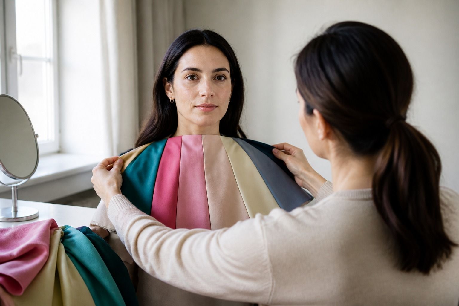
At home, begin with the feature that seems to change the face most. Do not start by naming a season. Stand near a window in indirect daylight, remove makeup if that feels comfortable, and pull your hair away from the face if its color is strong. A plain grey or off-white background helps because a brightly colored wall can cast a surprising reflection. Hold fabric under the chin rather than judging a shirt from across the room.
Temperature is a sensible first test for some people, but not for everyone. Compare a cool pink with a warm peach, a blue-red with an orange-red, or a cool green with a yellowed olive. Look for changes around the eyes, mouth, and jaw. The better color usually makes the face look more even, while the poorer one may draw attention to redness, shadows, or a grey cast. These effects are subtle, so make the comparison several times and take photographs from the same position if you need a second look.
If warm and cool pairs both look plausible, test softness next. Put a smoky blue-grey beside a clean turquoise. Compare muted plum with clear purple. Soft colors often create a quieter frame around the face, while clear colors can look separate or overly loud. The reverse can happen too. Someone who needs clarity may look tired in dusty shades even when the temperature is correct.
Depth is another useful checkpoint. A pale, delicate color may disappear near a face that needs more weight, while a near-black shade can make a low-contrast face look smaller inside the outfit. Try medium versions before jumping to extremes. Smoky navy, medium teal, rosewood, and cocoa tell you more than a test built only from white and black. The aim is to find the range where the face remains visible and the clothing does not become the first thing you notice.
Write down the result of each comparison in plain language. Warm is better than cool is less useful than warm ivory makes the skin look clearer and cool white makes the mouth look dull. Those notes describe your actual response to color. They also help when a later quiz produces a label that does not match your first impression.
Understand neighboring seasons
Many uncertain results happen because the best colors sit between broad season families. A person may be more comfortable in the light end of Spring and the warm end of Summer, or may find that softened Autumn shades work until they become too yellow. Border seasons are not a failure of analysis. They simply show that color characteristics change gradually, while labels are drawn with firm lines.
Light Spring and Light Summer can both handle pale colors, but they usually separate on temperature. Warm ivory, apricot, and light aqua can support Light Spring. Soft white, cool pink, and misty blue may be easier for Light Summer. If both groups work, compare their clearest differences near the face rather than deciding from a pale beige that belongs to neither.
Soft Summer and Soft Autumn are another common crossing point. Both favor low intensity, so a dusty rose or mushroom taupe may look perfectly reasonable in either wardrobe. The question becomes whether the fabric looks better with a cool blue base or a warm golden base. A muted mauve and a muted cinnamon create a more useful test than medium grey, which can flatter almost anyone by being quiet.
Deep Autumn and Winter can overlap when dark colors feel comfortable. Deep chocolate, warm forest, and rust point toward Autumn. Ink navy, cool burgundy, and blue-red point more toward Winter. Brightness matters as much as depth. If a dark color works only when it is softened, you may not need the clear, high-contrast end of Winter even if black is a familiar wardrobe staple.
When two seasons keep competing, keep both names as working references and compare the colors that belong to only one side. You do not have to solve the boundary before buying a coat. A charcoal coat, muted navy knit, or medium berry top can often sit comfortably across neighboring palettes while you continue testing.
Use quizzes as a starting point
A color season quiz can help you notice patterns, especially if you are new to terms such as chroma and value. It cannot control the lighting in your photo, the color balance of your screen, the makeup you are wearing, or the effect of dyed hair. Some questions also ask about colors you already own, which means the result may reflect habit rather than what truly works near your face.
If you take a quiz, answer from several ordinary photographs rather than one carefully edited image. Avoid using a photo with a warm filter or a strong background. When the questions ask about eyes, hair, or skin, describe what you can see in neutral daylight and do not treat one feature as the deciding proof. A dark eyebrow does not automatically make a person Winter, and visible cheek redness does not automatically make a person warm.
Look for a pattern across results. If one quiz says Summer, another says Soft Autumn, and both explanations point toward softened colors, that shared trait may be more useful than the season name. If one result is Spring because you selected bright coral but your wardrobe tests repeatedly favor muted teal, put more weight on the repeated fabric comparison. The label is a shorthand for the evidence, not a replacement for it.
Be wary of a test that promises guaranteed accuracy or treats a result as a permanent fact. Even a careful analysis gives you a range of useful colors, not a rule that controls every item you wear. A favorite black jacket can still work when the right neckline, lipstick, scarf, or texture creates enough balance. The point is to understand the trade-off, not to ban the jacket.
Test the season in your wardrobe
Once you have a likely season, take ten garments from your wardrobe and sort them by what happens near your face. Include a top you reach for often, a color you keep buying but rarely wear, two neutrals, and several shades from the suspected palette. Try them in daylight with the same hairstyle. A color that looks good on a hanger may create a dull strip under the chin, while a less exciting swatch can make the face look more awake.
Test colors in pairs rather than one at a time. Put a soft navy beside black, rosewood beside bright red, and warm ivory beside optic white. Ask which side makes you look more like yourself. You are checking the relationship between the face and the fabric, not trying to make your skin look a different color. Notice whether you need extra makeup, a necklace, or a darker bottom to make the shade feel balanced. That information matters because it tells you how easy the color will be on an ordinary morning.
Build a small working palette with three groups: reliable neutrals, easy colors for tops, and accents you enjoy wearing. Leave room for colors that are outside the supposed season but fit your style. A warm brown bag may be far from your best face-adjacent shade and still be an excellent accessory. A cool blue jacket can work with a warmer season if the shirt underneath creates a better transition.
After a few weeks, review what you actually wore. The strongest result is not the most dramatic color in a fan. It is the group of colors that makes outfit decisions simpler and keeps you from constantly fixing the face with accessories. If your answer to what season am I remains two neighboring seasons, that is workable. Keep the shared colors, learn the differences, and let real clothes make the final call.